5 Tips for Top-Notch Images in Every Email
Images can make or break your email. The right image can draw a recipient’s attention and increase the likelihood of clicking on your call to action.
“Images are critical to emails,” says Russell Cragun, the marketing manager at Doba, a Utah-based shipping company. To make sure you’re getting the most bang for your visual buck, we put together a few tips to utilize email images well.
1. Use crisp images
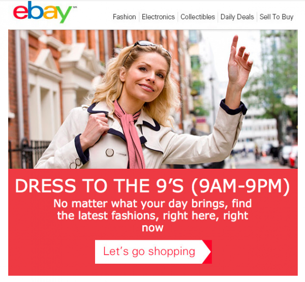
Now is not the time for amateur photography. You want eye-catching images that make your email recipient take notice, Cragun suggests. Check out the email below. EBay uses one simple image to promote its “Dress to the 9s” sale. The image is simple, yet gets your attention; the colors pop; it’s not pixilated or blurry; and it relates to the content. That’s the kind of image you want. Tip: Use 72dpi images for emails and always size down an image (larger to smaller), never try to size up (smaller to larger) – This will prevent blurriness and pixilation.
2. Showcase your product well
When showcasing your products via email; you want your products to look good. If you’re not well versed in photography, consider hiring a professional to take some glamor shots of your products. Take a look at the email below from Coach. The products are nicely and clearly displayed. There aren’t any distracting backgrounds or colors, which allows the products to steal the show.
3. Stock photo sites are always a possibility
If you’re in need of a few general images, you can always go to a stock site like iStock or Shutterstock. When you’re searching for images, try to use specific search terms so you get a unique list of options. Sift through a few pages and see what fits your content needs and what catches your eye. Ensure you follow usage rights for any images you select.
4. Graphics or artwork can work, too
Are you trying to showcase something that’s less than visual? Solve the problem by creating graphics or some sort of artwork. The email below, for example, is to encourage recipients to nominate someone for a content marketing award. That’s could be a tough one to find a visual for. However, the strip of artwork on the top adds some dimension to the email, don’t you think? You don’t always have to use a picture.
5. Don’t go overboard
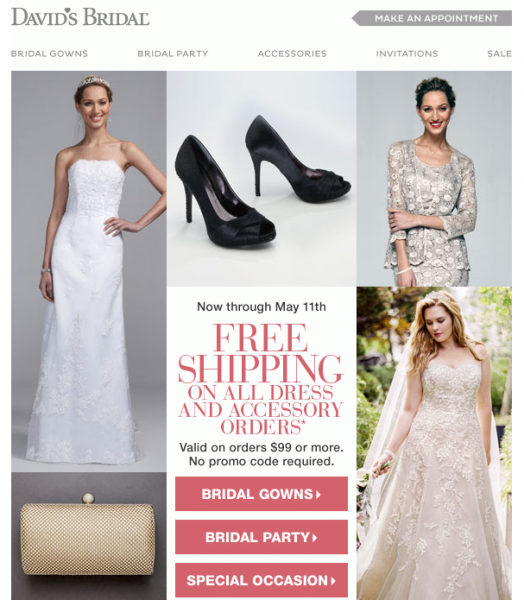
You can use more than one image, but if you use too many, you may run the risk of overwhelming your subscriber. Fortunately, if you’re using VerticalResponse to send out emails, there are plenty of templates to pick from. With the right template, you can use multiple images without making the email look cluttered.
The email below uses five pictures, which sounds like a lot, but this email design works. The placement of the pictures draws your attention to the text and call-to-action buttons in the middle.
How do you find and use pictures for your emails?
Want more practical marketing tips and advice? Get the VR Buzz delivered daily.
© 2014, Contributing Author. All rights reserved.
