Brand relationships: Logo design + email marketing
What does logo design have to do with email marketing? Everything, in fact. Because while your logo is just that – your logo – it’s also so many other things. It’s the cornerstone of your brand, the image by which your customers recognize and remember you, and the guiding light for your design, fonts, and colors. So where does email come in?
When you consider that 72 percent of consumers prefer to communicate with businesses via email, that means that nearly three-quarters of your customers would like to hear from you in their inbox. Your brand, and logo, need to be inextricably linked to your email marketing. We took a look at a couple emails in our inboxes to give some inspiration for how you can incorporate your logo into your email marketing.
Consistent elements
Incorporating your logo into your email marketing can be incredibly simple – just include your logo in your header (and footer) to remind readers of your brand before jumping into the campaign message. For this restaurant, their logo is front and center before you get into the body of the email. Before you make any decisions about where to dine, you’ll remember Stones Throw. The colors and fonts of the logo are also incorporated throughout the body of the email; having a consistent color theme and font scheme gives your websites, emails, and landing pages a professional finish. Take note of the horizontal layout of the logo in the header – it makes a great lede image and catches attention.
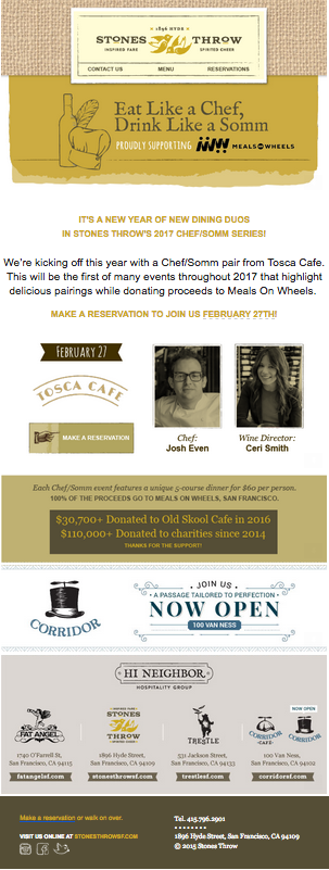
Bonus: As part of the Hi Neighbor restaurant group, Stones Throw emails include their sibling restaurants’ logos in their email footer. This ties their brand story together, and ensures that all emails from this group have consistent logo placement in all communication. Remember that horizontal logo from the header? For the footer, the restaurant uses a stacked, or vertical, logo to fit with the other group logos. This is a great example of how to use the different variations of your logo, all within one email.
Colorful creativity
If putting your logo front and center is too obvious or feels like too much of a pitch for your brand, consider incorporating it in more subtle ways. For this fitness studio, their logo is a supporting design element to the overall message of the email. For their Valentine’s email, the message is all about “love,” which the brand cleverly combines with one of their business hashtags “#uforialove.” By playing off this message and constantly reiterating the words, “love” and “uforia,” they can sneak in the business name multiple times, so when you see the logo for uforia studios in the photo, it feels like a cohesive experience.
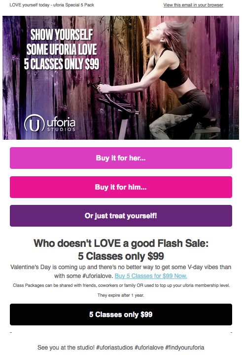
Bonus: Because uforia studios uses shades of purple for the business’s brand colors, they add an ombre tint to the photograph, and then use those various purples and pinks to create several bold call to action buttons (CTAs).
Subtle signals
Incorporating your logo into your email marketing can be a fine balancing act. For lifestyle site Well+Good, the neutral colors and clean lines of their logo and brand identity are carried into the body of their email. Ample white space and digestible copy breaks help them keep their emails uncluttered and direct.

Bonus: Subtle nods, like the logo’s plus symbol are used in the “+ read more” CTA of individual articles reflect the logo and brand throughout the newsletter.
Love your logo
Remember that there are endless options for how you can incorporate your logo into your email marketing. From headers to photos and everywhere in between, there is a space to feature your logo. Every aspect of your marketing tells part of your brand story. Your logo should live on your website, emails, business cards, and anywhere else you can imagine. Don’t be afraid to have some fun and get creative with your logo placement.
Download our Guide to Logo Design
© 2017 – 2018, Contributing Author. All rights reserved.
 DOWNLOAD FREE EBOOK