The Dissection of a Bloody Good Email Newsletter
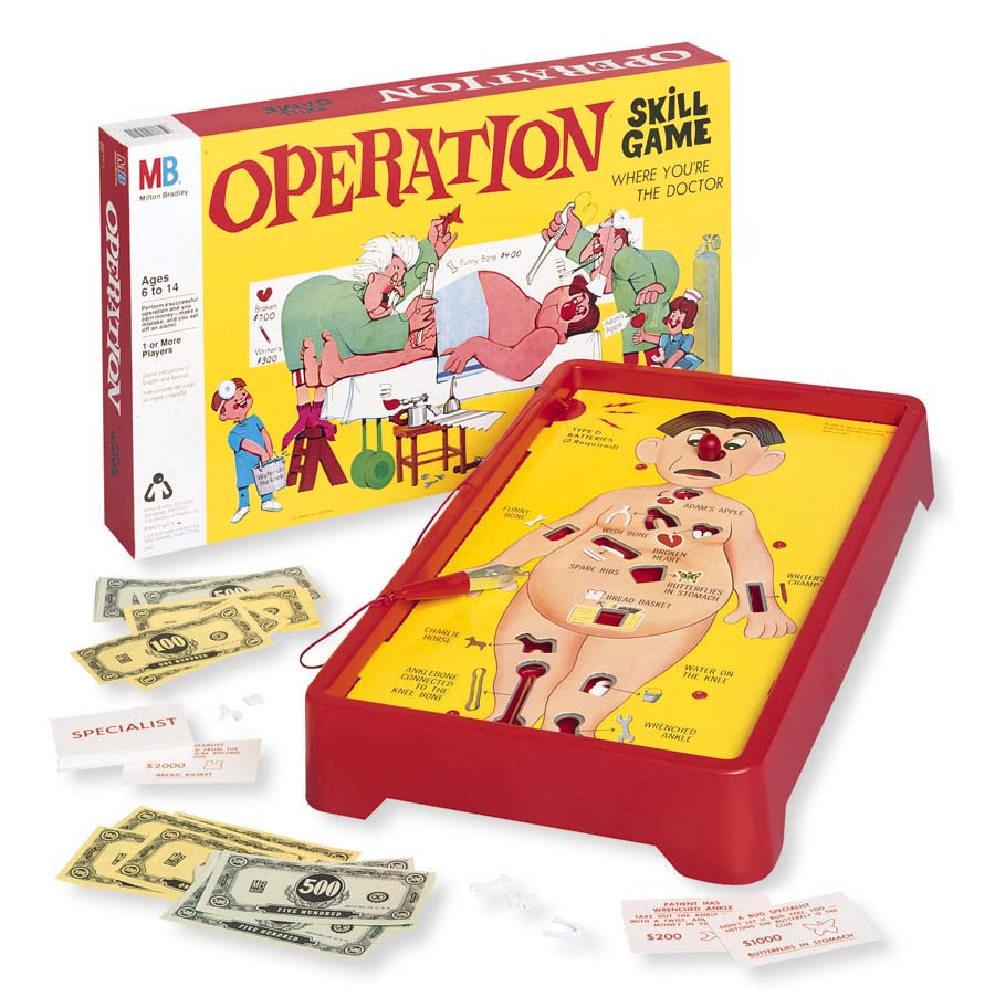
Are you familiar with the old school Milton Bradley game, Operation? It tests your ability to remove ailments (like a broken heart) from a patient using a pair of tweezers connected to a wire. If you aren’t precise enough in removing the ailment, BUZZ! the alarm sounds, the patient’s bright red nose lights up, and you’ve lost your turn.
Anatomy, deriving from the Greek translation, “I cut up, cut open,” and the ability to piece together or dissect things carefully is also a test to your email marketing skills. Concoct an engaging email newsletter with all of the right parts and you win; otherwise, you risk losing a turn, or worse, readers. So what makes up the anatomy of a bloody good email newsletter? Let’s operate:
1. Intriguing Subject Line & Pre-header – Just like the smell of sweet apple pie, your subject line needs to lure readers in with its potency. Avoid generic subject lines like: “This Month’s Newsletter, Newsletter #3, Upcoming Events” etc. because these subject lines don’t entice, incentivize an open, or give readers any clue about what’s actually in your newsletter. Get creative, have fun, try new things and test out a bunch of different subject lines. Treat your pre-header as a secondary subject line and include even more info about what goodies are awaiting readers inside. Remove carefully: Your company name from the subject line – This is what the “from label” is for; otherwise it’s taking up valuable open-inducing space.
Here are a few recent retail subject line examples:
2. Masthead/logo (linked) – Have a specific logo for your newsletter, give it a fun name like, “The Irresistible Insider,” include a masthead and/or your company logo and always remember to link it! You’re giving customers tons of valuable content, so give them a path back to your site, especially if they want to sign up and/or spend. Remove carefully: Unnecessary space – You want to include a masthead and logo, but if it’s too large, you’re pushing juicy content below the fold. Here’s an example of an effective email newsletter masthead from the California Academy of Sciences.
3. Table of Contents – You only have 51 seconds (the average amount of time someone spends on an email newsletter) to grab your reader’s attention. If they do not know immediately what’s in store for them, he/she won’t be bothered to scroll past the top fold. We’ve tested this in our very own VR Buzz only to discover that when a table of contents is included, readers chose to read which content interests them the most versus what we place at the top, resulting in more clicks, especially on content found near the bottom.
4. Compelling Content (in brief, scannable paragraphs, content blocks, bullet points and/or numbered lists) – Like blood in a beating heart, your email newsletter needs rich, healthy content pumping through it to keep it revived and alive. Need content ideas? Peruse the bullet points below:
- Blog Posts
- Tips, tactics, how-tos, tutorials
- Industry news/third party news
- Events, dates to remember, holidays
- Interesting facts
- Reviews
- Photos
- Contests/contest winners
- Resources
- Company news – updates, improvements, new products, awards, volunteer projects, etc.
- Infographics
- Webinars and/or videos
- Testimonials
- Recipes
- Fan photos
Remove carefully: Sales hype! The focus and point of your email newsletter is to educate and build rapport with your fan base of readers. Want to promote? Send sales-specific emails separately, or do so in moderation in your email newsletter from time to time.
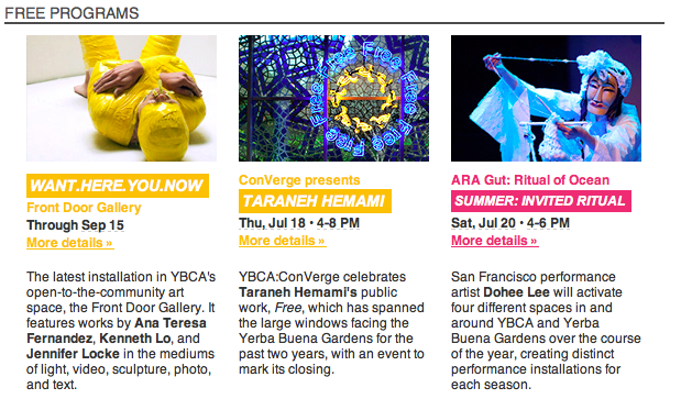
Here’s an example from a Yerba Buena Center for the Arts’s email newsletter:
5. “Pinnable” Imagery – Like a healthy body, you want your email newsletter to look “oh so fine.” We’re living in image-heavy times where Instagram and Pinterest compete for our attention spans. When selecting imagery for your newsletter, think “Would someone ‘pin’ this on Pinterest?” If so, you’ve won this round. Remove carefully: A single image as the entire content of your email. Yes, pics are important, but if you’ve photoshopped one large image as the content of your email and for some reason (‘cus it definitely happens!) a reader can’t download that image – BUZZ! your email newsletter will not be seen.
6. Concise Headlines and/or Subheadings – Email newsletters contain a lot of content, which is why breaking it up into blocks is wise, as is including images. However, people scan email newsletters like they do a newspaper – By reading the headlines first. If readers find the headline enticing, they’ll read on. No headlines? BUZZ! A reader may pass up valuable content. Give your content blocks enticing headlines or subheadings and link them back to the original source (blog, website, social network).
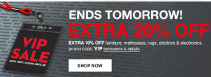
7. Clear Call-to-Action – You wouldn’t want a confused doctor to remove the wrong organ right? Same goes for your readers – Give them a defined path via a specific action you’d like them to take by including clear call-to-action links and/or buttons: “Watch the Video,” “Learn More,” “Get More Info.” This is an example from Macy’s.com. They’ve included compelling imagery, a concise headline and a clear call-to-action to promote their sale.
8. Links – The purpose of your email newsletter is to provide valuable content and get a click. Always provide readers a link with more information, whether it be to your website, blog or social site. Remove carefully: URLs typed out. Example: For more information, visit https://verticalresponse.com. Instead: For more information, visit VerticalResponse. By now, most readers understand what a hyperlink looks like (underlined and typically blue text). URLs take up valuable space.
9. Social Sharing Buttons & Social Networks – Like a toned bod, you’ve worked hard on your email newsletter, so flaunt it! Include social sharing buttons on your email newsletter so others can share it on their own social networks. Additionally, include social network icons so others can find you on Facebook, Twitter, etc.
10. Easy-to-Find Unsubscribe Link – We know what you’re thinking, “Why on earth would I want to make it easy for someone to unsubscribe?” Well, people do what they please, including unsubscribe from newsletters, but you can’t take it personally. Would you rather someone unsubscribe (with the option to opt back in later if they so desire) or brand you with the spam stamp? Give them a clear, easy out – This will also improve your open and click through rates by only keeping your most engaged readers around. Remove Carefully: Unsubscribe links in a light grey or off white so as to “hide” the link.
Now that you’ve pieced together and carefully removed various elements/ailments, you should have the makeup of a bloody good email newsletter. Have any additions? Let’s play!
Image of Operation courtesy of Milton Bradley
© 2013 – 2015, Contributing Author. All rights reserved.


