5 Copywriting Tips to Enhance User Experience
When it comes to copywriting and your business, you may have put a lot of thought into how you describe your product or service on your website or in ads, but have you considered how your copywriting impacts your user experience (aka UX)? Something as seemingly simple as the words you use can have a dramatic impact on how a visitor interacts with your site. In fact, Jeff Gothelf, author and UX guru, wrote in a post, The Secret Weapon of UX: Copywriting, that in the midst of a copywriting experiment, he found “just by changing words” on a website, he saw “an increase of paid sign-ups of nearly 30%.” Just by changing some words! “This was just one little experiment but if the power of words and copywriting can affect conversion dynamics so significantly, think about what words can do for progressing customers through a workflow and getting them to complete their tasks,” Gothelf says. “Copywriting is the secret weapon of UX.”
So what should you keep in mind when writing copy for your website? Here are five tips:
1) Identify your audience
Like many things in marketing, you need to start by knowing your target audience. Who are your website visitors, and why are they on your site? Are they looking for information? Making a purchase? Logging into an account? Most likely, you’ll have more than one type of visitor, so make sure the copy on your home page is relevant to who you’re trying to reach.
Google Analytics is a great way to know how people are interacting with your site. From which pages they visit, which keywords they searched to get there, to how long they stay, Google Analytics provides you tons of information. Check out our Beginner’s Guide to Google Analytics to help you get started.
2) Write simply and persuasively
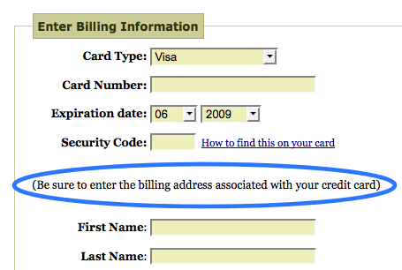
No one wants to reach for a dictionary while reading your website. According to a Harvard study, the average adult in the United States reads between the 8th and 9th grade level, so write simply, clearly and in a natural way. Clarify when needed, use terms your visitors are familiar with, and avoid abbreviations, acronyms and jargon. Also, use Microcopy. What is it? According to Joshua Porter on the interface and product design blog Bokardo, “Microcopy is small yet powerful copy. It’s fast, light, and deadly. It’s a short sentence, a phrase, a few words. A single word. It’s the small copy that has the biggest impact. Don’t judge it on its size…judge it on its effectiveness.” Here’s an example given from his blog:
3) Pay attention to information flow
Does the order you present information make sense on your site? Having to jump around and hunt for information can result in a frustrating user experience.
Make it obvious what information your visitor will get if they click a link by using very clear language. For example, if I click a button to get more specific information about your scented candles, I might expect to see information about your selection, ingredients, price, how to buy, or maybe some customer testimonials. I wouldn’t expect to find a page that includes your assortment of soaps and lotions. Ask yourself, “If a visitor clicks my action button to get to another page, does the information on the next page logically follow?”
4) Make Call-to-Action buttons clear
Speaking of buttons, the text you use on them can impact your click through rate. Be as specific as possible about what action you want the person to take and what they can expect if they click.
For example, the following buttons, “Buy Now” and “Get a Quote” are both pretty specific and let the visitor know what to expect when they click.
But,
isn’t a very informative button, and doesn’t give your visitor a very good idea of where they’ll “land.” (An exception is if there is a very well defined sequence of information your potential customers expect to see, for example, “next” takes you from step 3 to step 4).
Don’t be tempted to be vague to get more clicks – You’ll likely annoy your visitors. It’s easy to create buttons (try our free tool), so there’s really no reason to use a one-size-fits-all approach.
5) Test, test and test again
Have people in your target demographic read the copy you’ve written? Make sure they read it in context- What makes sense in a Word document might not be as clear when seen on your website mixed in with colors, images, navigation, etc. Ask them to perform a few basic tasks like finding your price list or store location. Also ask them to summarize the text on a page. If they can give you a quick and accurate summary without having to re-read or use their “back” button, your copywriting is doing its job in enhancing the user experience.
What tips and tactics do you use to ensure good a good user experience for your website visitors?
© 2013 – 2018, Contributing Author. All rights reserved.


