The 5 Easiest Ways to Bring Your Email Design into 2014
So you’ve made your list of New Year’s resolutions and, perhaps, it doesn’t include, “Improve my email marketing campaigns” (sigh). That’s okay. We know when you return to your desk this January, you’ll remember, and we’re ready to help!
What’s new on the email marketing horizon for 2014? Litmus reported earlier this month that over half of all emails are now viewed on a mobile device — a 24% increase from Nov. 2012 to Nov. 2013! So as you can imagine, the emails of 2014 will be designed largely with mobile in mind. The quantity of emails we receive on a daily basis has also increased, so when you send email, keep in mind that you’re competing with many others. With that, here are some fresh email design tips to keep up with the times.
1. Ditch the side column
Mobile viewing means smaller screens, and no one wants to squint! Those skinny side columns that use to hold your extra news bits are becoming a thing of the past. Remember, readers are looking for easy-to-scan content. Two or three sections going down the page, with a minimum font size of 12 will make it much easier on your readers.
2. Keep it clean
There are a number of reasons to keep your design clean: you want a design that’s easy on the eyes for your readers, and too many ‘bells and whistles’ can lead to distortion among the various email providers and web browsers. Use clear headers with a larger font size than the rest of your text. A little whitespace also helps the eyes scan your email more efficiently.
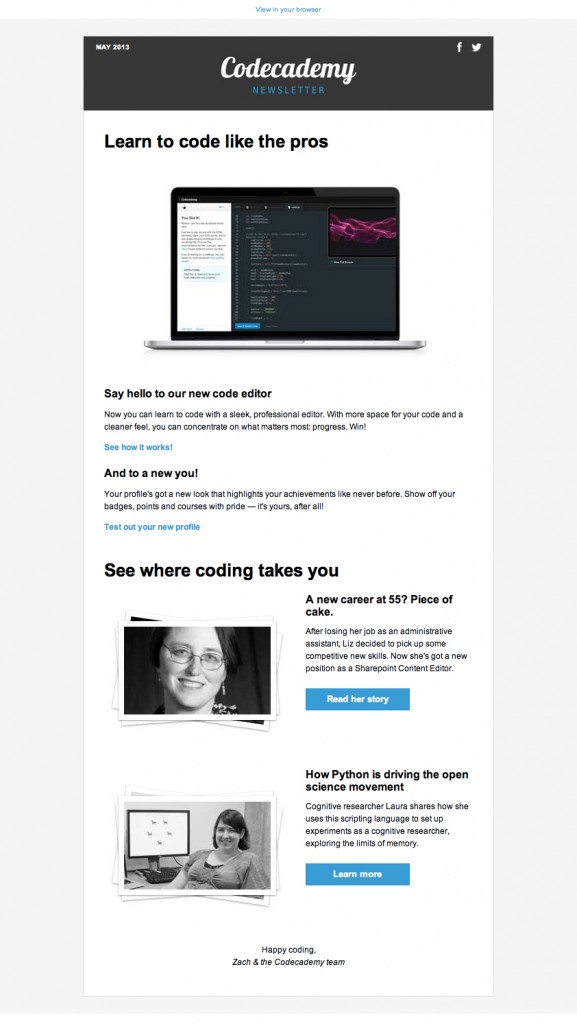
Here’s a sample of a nice, clean design by Codecademy:
A few additional tips:
- Include your logo in a banner or anywhere at the top of your email.
- Align text to the left, as readers’ eyes naturally scan left to right.
- Include call to action buttons near the top of your email and/or after each section of digestible content.
- Create space between sections – Include short paragraphs with concise text.
3. Slim it down
Size does matter in email marketing. We recommend a width of 600 px for your email design. Why? Because it will fit better on a mobile device and inside email clients.
4. Make it touchable
I really like this email, but there’s something off about it that I just can’t put my finger on… no seriously, the link is too small and I can’t put my finger on it!
With mobile in mind, make sure your call to action buttons are a fair size for the human finger. A recent article by MarketingProfs points out “the average adult finger pad is 10-14 mm, which roughly translates to 37-53 pixels.” So a button of 50 px is a good idea.
5. Test it
If you’re still not testing your emails, you’re living in the past! Nothing ruins an email like a broken link, distorted text, or a typo in the subject line! You can test it yourself using a few different email accounts (It’s a good idea to test in Outlook, Gmail, Internet Explorer and on a smart phone). Or you can simplify and test many platforms at once using Email on Acid.
This post would be remiss if we didn’t also mention responsive design. Responsive design is a great way to ensure your emails look good on mobile devices and on desktops. It does, however, require some investment. Click here to learn more about response email design.
What are you planning to change in your 2014 email marketing? Let us know in the comments!
© 2013 – 2018, Contributing Author. All rights reserved.

![Open AI vs Claude: What Small Businesses Need to Know for Smarter Email Marketing [2026]](https://verticalresponse.com/wp-content/uploads/2026/03/a7d5a329-9653-486e-af92-d645f63d8b64-1.png)


