5 Simple Steps to Structuring Your Email for Maximum Engagement: Best Practices for 2024
Are your email marketing efforts getting lost in the inbox? Discover the 5 simple steps to structuring your email for maximum engagement, and transform your email campaigns. Learn how to craft compelling subject lines, write engaging preheaders, create clear email bodies, optimize calls to action, and ensure mobile responsiveness.
Key Takeaways for Email Marketing
-
Craft compelling subject lines and preheaders to boost open rates and create curiosity.
-
Maintain a clear and concise email body focusing on a single topic to keep recipients engaged, which is crucial for successful email marketing campaigns.
-
Ensure mobile responsiveness for your emails to enhance user experience across devices.
Craft a Compelling Subject Line

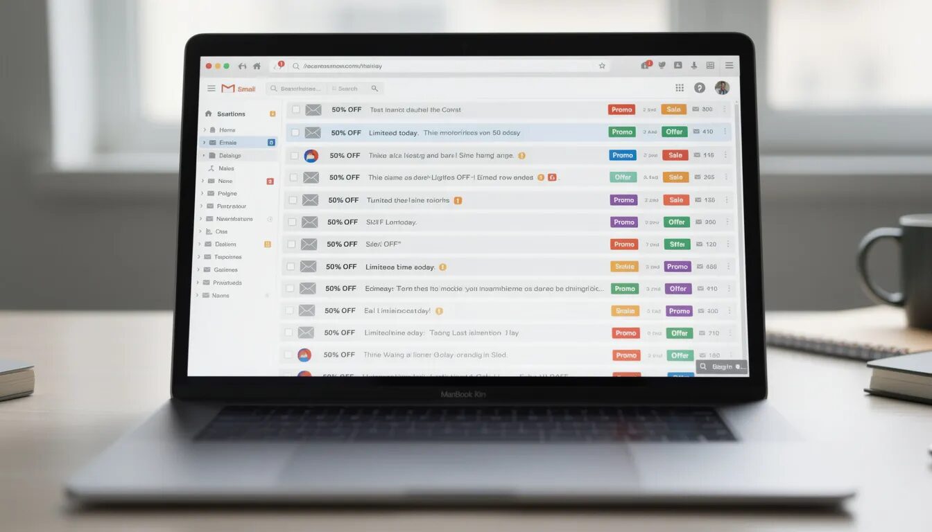
The subject line acts as the entrance to your email. Recipients first notice it, and its effectiveness dictates whether they’ll engage with your message or ignore it in their inbox. Consider the subject line as making a critical initial impression—you have one opportunity to grab attention. To drive engagement, crafting compelling subject lines is key for prompting recipients to view your content as part of a successful email campaign.
Having a recognizable sender name can considerably elevate open rates by cultivating trust and lending weight to your subject line. Emails from known and trusted senders are more frequently opened by individuals. Ensure that emails you send come from a name familiar to and favored by your audience.
As we find ourselves in 2024, hyper-personalization has transcended being merely fashionable—it’s become imperative. Incorporating personalized touches into subject lines significantly increases the likelihood of someone opening an email due to personalization’s impact on open rates—this could include using names or other specific information gleaned through an email marketing tool.
Employing A/B testing for different versions of a campaign’s subject lines can pinpoint which ones appeal most effectively to intended recipients. This involves initially sending two variant options within the same theme but differing textually or stylistically, then later deploying broader circulation based upon superior performance metrics observed amongst segmented portions of target audiences during preliminary distribution phases.
To ensure emails reach their destination rather than derailing into spam purgatories where visibility plummets substantially, one must judiciously avoid utilizing certain phrases such as “opt-in,” including prompts like “click below,” or overusing punctuation marks since these elements actuate filters pushing messages directly into junk mail voids where they go unnoticed by those whom they were meant for.
Email Subject Lines Dos and Don’ts
When it comes to crafting effective email subject lines, there are certain dos and don’ts to keep in mind. Here are some best practices to help you create subject lines that grab attention and drive opens:
Using Emojis in Email Subject Lines
Emojis can be a great way to add some personality and whimsy to your email subject lines. However, it’s essential to use them sparingly and strategically. Here are some tips for using emojis in email subject lines:
-
Use them to add tone: Emojis can help convey the tone of your email and add some personality to your subject line. For example, a smiley face can make your email feel friendly and approachable.
-
Use them to highlight importance: Emojis can be used to draw attention to important information or promotions. A star emoji can highlight a special offer or a key announcement.
-
Use them to add visual interest: Emojis can help break up the text and add some visual interest to your subject line. A well-placed emoji can make your subject line stand out in a crowded inbox.
-
Avoid overusing them: Too many emojis can look spammy and overwhelming. Stick to one or two emojis per subject line to keep it clean and professional.
Personalization in Subject Lines
Personalization is a powerful way to increase engagement and drive opens. Here are some ways to personalize your subject lines:
-
Use the recipient’s name: Addressing the recipient by name can create a sense of familiarity and increase opens. For example, “John, check out our latest offers” feels more personal than a generic subject line.
-
Use tailored content: Tailor the subject line to the recipient’s interests or preferences. If you know a subscriber is interested in a particular product, mention it in the subject line.
-
Use location-based targeting: Use location-based targeting to create subject lines that are relevant to the recipient’s location. For instance, “Exclusive deals for New York residents” can make the email feel more relevant.
-
Use behavior-based targeting: Use behavior-based targeting to create subject lines that are relevant to the recipient’s behavior. If a subscriber recently browsed a specific category on your website, reference it in the subject line.
Write an Engaging Preheader
The preheader is often underestimated, yet it’s a vital element of your email. Preheaders are essential in creating the initial impression and influencing whether or not an email will be opened. Think of the preheader as a continuation of your subject line, providing additional enticement for recipients to engage with your message.
Crafting an effective preheader can give recipients a concise summary of what to expect in the body of the email, aiding their decision on engaging further. It serves as a preview that hints at what awaits within the mail, similar to how a movie trailer operates. An optimal preheader length ranges between 30 and 80 characters for optimum visibility across various devices.
To capitalize on its effectiveness, place critical information at the beginning of your preheader text. This guarantees that even if some devices do not display it fully, you still convey your principal message clearly.
It’s crucial for preheaders to work alongside subject lines in order to capture readers’ interest effectively—they should weave together narratively and spark curiosity among readers. Mastering powerful preheaders could greatly increase open rates—making them invaluable components within any strategy focused on email marketing success.
Keep in mind that depending upon which email client or device is used—and influenced by subject line lengths—the visibility of these snippets may vary substantially. Conduct thorough tests over multiple platforms so you’re confident they appear appropriately and leave an impactful impression. Including preheaders in your email marketing tips can significantly enhance your overall strategy.
Create a Clear and Concise Email Body

Maintaining the attention of your target audience after they have opened your email is crucial. A well-crafted, brief email body plays a vital role in keeping them engaged. Employing formatting elements such as bullet points and bolded text can greatly enhance readability, allowing readers to easily skim through and grasp essential details within effective email marketing campaigns. Such tactics serve to bolster your overall email marketing strategy, support persistent efforts in the realm of this type of promotion, and align with savvy tips for successful outreach.
Emails that are concise tend to see higher read rates, which may lead to better response frequencies. Strive for emails that average between 80-100 words—adequate length especially suited for mobile device screens—in order not only to keep but also to command audience engagement without overwhelming them.
Ascertain that critical segments of content appear at the beginning. Their impact will be most pronounced since many people scan messages quickly before deciding whether it’s worth their time or discard those perceived as overly long-winded or irrelevant. Arranging information strategically ensures that key points stand out promptly when viewed.
Catering directly to what interests your audience by offering actionable advice, exclusive deals, and pertinent news helps meet their expectations while remaining consistent in tone throughout all written material accentuates a single subject matter enhancing brand awareness firmly establishes cohesive messaging congruent with recognized branding principles.
Finally adopt an enticing visual format—aesthetic appeal has its merits beyond professionalism—it smartly navigates reader’s focus towards significant portions thereby optimizing viewing experiences within any given piece from an array of email marketing campaign communications.
Keep Your Email On-Brand
Your email should reflect your brand’s tone, voice, and visual identity. Here are some ways to keep your email on-brand:
-
Use your brand’s colors: Use your brand’s colors to create a consistent look and feel. Consistent use of colors helps reinforce brand recognition and makes your emails instantly recognizable.
-
Use your brand’s typography: Use your brand’s typography to create a consistent look and feel. Consistent fonts contribute to a cohesive visual identity.
-
Use your brand’s imagery: Use your brand’s imagery to create a consistent look and feel. Incorporate images that align with your brand’s aesthetic and messaging.
-
Use your brand’s tone and voice: Use your brand’s tone and voice to create a consistent tone and voice. Whether your brand is casual and friendly or formal and professional, ensure your emails reflect that personality.
Use the Layout to Enhance User Experience
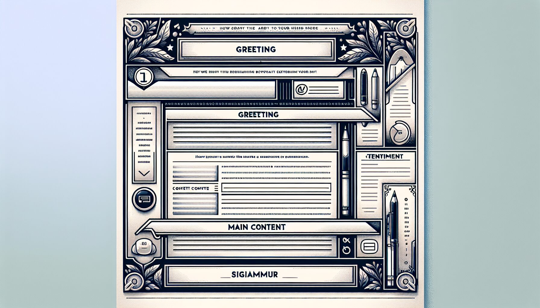
The layout of your email can greatly impact the user experience. Here are some ways to use the layout to enhance user experience:
-
Use a clear and concise header: Use a clear and concise header to create a clear hierarchy of information. A well-defined header helps readers quickly understand the main message of your email.
-
Use a clear and concise body: Use a clear and concise body to create a clear hierarchy of information. Break up text with subheadings and bullet points to make it easier to read.
-
Use white space effectively: Use white space effectively to create a clean and uncluttered design. Adequate white space improves readability and makes your email look more professional.
-
Use images effectively: Use images effectively to break up the text and add visual interest. Relevant and high-quality images can enhance your message and make your email more engaging.
By following these best practices, you can create emails that not only capture attention but also provide a seamless and enjoyable experience for your recipients.
Optimize Calls to Action (CTAs)

The call to action (CTA) is the critical point where you inspire your email recipients to engage in the desired behavior as part of your email marketing efforts. It’s vital for CTAs to be both strategically positioned and persuasive to prompt recipients towards clicking and interacting. Place your main CTA prominently within early parts of the email content for better immediate visibility, employing contrasting hues that draw attention while allowing ample space around each CTA button or link, thus improving their prominence and minimizing user annoyance.
Experiment with various aspects of your CTAs – from wording choices to visual design elements – as this can heighten interaction rates significantly. Utilize UTM tracking parameters for insights into which variations resonate most effectively with your audience base.
To keep emails focused yet versatile enough to address different subscriber preferences, a well-calibrated blend of CTAs is essential. Incorporate less conspicuous secondary CTAs so they don’t overshadow but rather complement the primary call-to-action, ensuring clarity without inundating readers.
Ultimately, enabling recipients effortlessly proceed with an intended action remains key—be it following a hyperlink, completing a purchase order or registering for an event. Ensure every CTA within your communication stands out clearly and persuasively drives them towards taking those steps.
Ensure Mobile Responsiveness

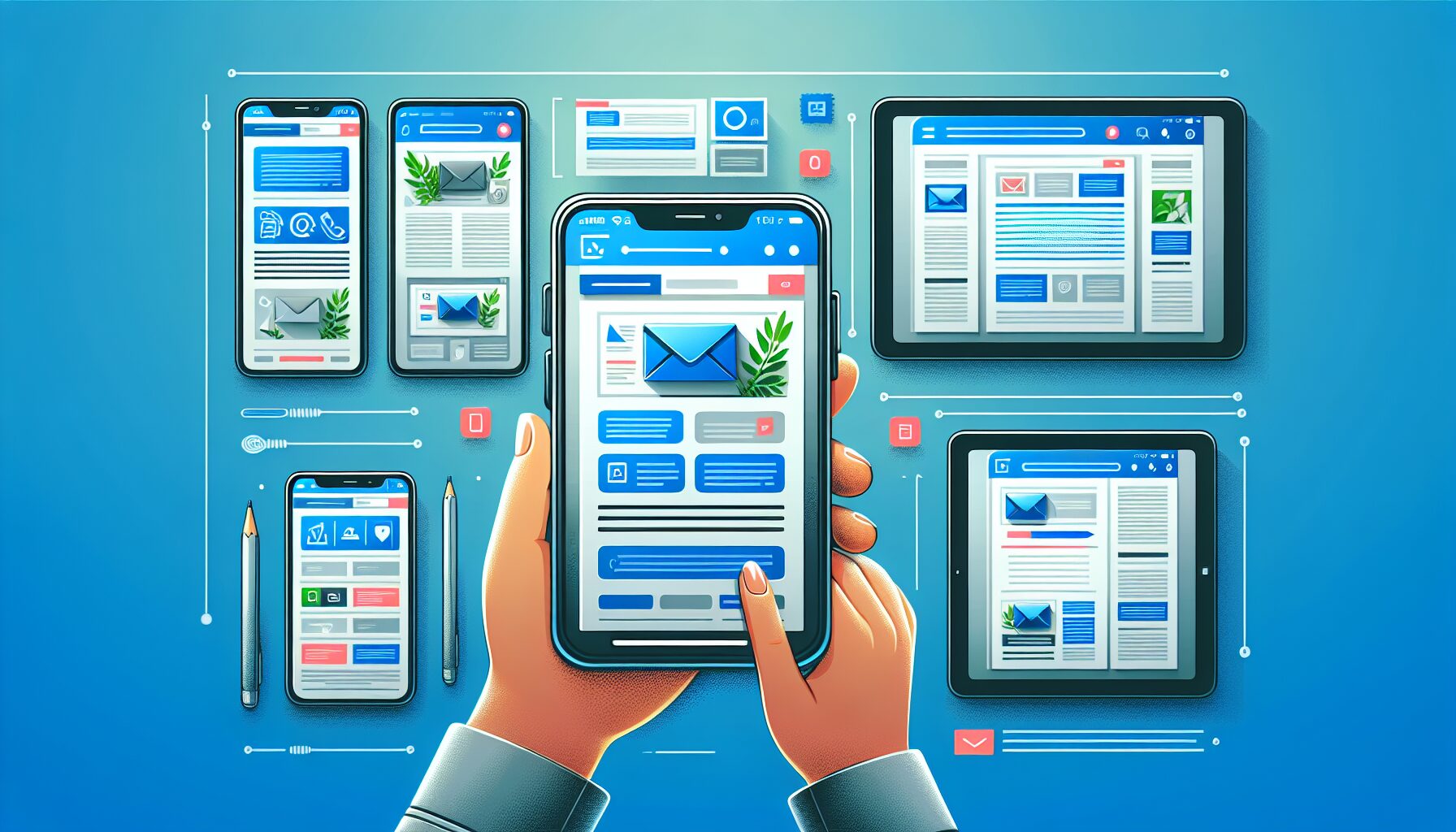
In the current era where mobile precedence is a standard, it’s essential to make your emails adaptable for mobile use. Employing responsive design through fluid grids and media queries customizes your emails across diverse devices and screen sizes, thereby optimizing user experience by simplifying navigation and interaction with your content.
The adoption of responsive design significantly boosts user engagement as well as retention of information in emails. When users find it straightforward to read and engage with content on their handheld devices, the likelihood of an email’s effectiveness increases considerably.
To guarantee that emails are displayed uniformly across various platforms and devices, conducting rigorous testing is pivotal. This will help pinpoint any rendering problems while making sure that the appearance of your mails remains top-notch wherever they’re accessed.
It’s also advisable not to overcrowd links within an email since this can hinder ease of clicking, particularly on compact screens. Prioritize creating concise call-to-action (CTA) buttons instead. These CTAs should adhere to best practices while being effortlessly actionable on mobile gadgets.
Implementing flexible layouts via fluid grids complemented by media queries positions you at the forefront when adjusting screen dimensions effectively, thus maintaining both visual allure and functionality in all viewing circumstances regardless of which device is utilized for reading those meticulously crafted e-mails. This approach also helps maintain a good reputation with internet service providers by ensuring emails are well-received and not flagged as spam.
Summary
To maximize engagement in your email marketing, it is essential to follow a strategic approach. Start by devising an enticing subject line paired with a captivating preheader to grab the attention of your audience immediately. Ensuring that the body of your email is clear and succinct will help convey your message effectively.
It’s vital to refine your calls to action so they inspire recipients towards the desired outcome, while also making sure that emails are mobile-responsive, thus maintaining accessibility and functionality across various devices.
Embracing these best practices, along with using a reliable email service provider, can dramatically enhance the effectiveness of your email marketing endeavors and lead to increased levels of interaction from subscribers. Embody these recommendations and begin revolutionizing your email campaigns without delay!
Frequently Asked Questions
Why is the subject line so important in email marketing?
A well-crafted blog post often emphasizes the importance of the subject line as your first chance to grab attention and drive engagement, so make it compelling! A great subject line can significantly increase your email open rates.
What is the ideal length for a preheader?
Email marketing tips often suggest that the ideal preheader length is between 30 and 80 characters, striking the perfect balance for visibility on various devices.
Keep it concise to grab attention and improve engagement!
How can I make my email body more engaging?
To create successful email marketing campaigns, make your email body more engaging by using formatting techniques like bullet points and bold text, and keep your content concise while highlighting key information.
This will capture attention and make your message more effective!
What are some best practices for optimizing CTAs in emails?
To truly optimize your CTAs in an email campaign, make sure they stand out with contrasting colors and generous spacing.
Testing different elements will help you discover what resonates best with your audience and boosts engagement!
Why is mobile responsiveness important for email marketing?
Mobile responsiveness is crucial for email marketing because it enhances user experience on any device, leading to better engagement and retention, which is essential for maintaining a good reputation with internet service providers.
Make sure your emails look great on all screens to captivate your audience effectively!
Are you interested in finding out more? Browse the rest of our blog for other marketing tips. If you’re ready to create your first email, survey, sign-up form, or landing page then register for a free trial to get the tools you need to build powerful marketing campaigns!
© 2024, Vertical Response. All rights reserved.


