5 Easy Ways to Epic Web Buttons That Get More Clicks!
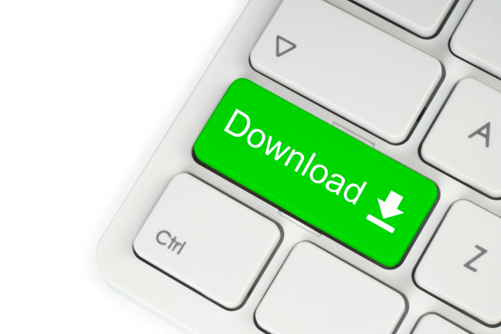
When anyone visits your website, or reads your emails, you want them to take ACTION! So, lead them down a path to take ACTION by using web buttons that don’t leave ’em guessing what they should do. Follow these easy tips to create web buttons that get people clickin’!
Use Active Verbs – Since your web buttons let your reader know exactly what you want them to do, always use active verbs in your buttons. While the verb may depend on the action you want them to take popular ones include:
Check out some other useful web button verbs and examples of how to use them, from Skadeedle friends, SmartLab Software here.
Bigger is Better! – Make your web button stand out and draw attention so it gets clicked on. Shoot for around around 225px wide and 45px high. Got multiple buttons? If you want them to “Buy Now,” more than “Learn More.” make the Buy web button bigger! Using web buttons on mobile devices? Try 44px x 44px.
Space Out – Leave a few pixels of white space around your web button to draw your readers eye, plus anyone viewing your page on a mobile device can click on your button with their fingers vs. a mouse. No fat fingering here!
Position for Results – If ya can, get your web button above the fold for email, and in the top portion of any webpage. If you place your web button lower, here are a bunch of ways to make it stand out.
Pop It With Color – Use a contrasting color compared to the background color so it’ll stand out!!
And keep testing colors, shapes, words and sizes for epic results! Ready to make your own web buttons that convert like crazy?
© 2012 – 2018, Contributing Author. All rights reserved.


