Creating a High-Converting Landing Page: Tips and Examples
A landing page is a single web page aimed at converting visitors into leads or sales by focusing on one action, like signing up or buying. In this article, you’ll learn how to create effective landing pages with tips and examples.
Key Takeaways
-
Landing pages are designed with a singular focus to convert visitors into leads or sales, eliminating distractions and enhancing clarity.
-
Key elements for success include compelling headlines, effective calls to action (CTAs), and strong visual elements, all of which drive user engagement.
-
Following best practices such as keeping content above the fold, minimizing distractions, and incorporating social proof is essential for maximizing conversion rates.
What is a Landing Page?
A landing page is specifically created for a marketing campaign, directing visitors to a single call to action. Unlike typical web pages that serve multiple purposes, landing pages are designed with a singular focus: to convert site visitors into sales or leads. This clarity and simplicity are what make landing pages so effective in marketing.
The primary goal of a landing page is to guide visitors towards a specific action, whether it’s signing up for a newsletter, downloading an eBook, or making a purchase. Targeting visitors with tailored content, landing pages reduce the cost of acquiring leads or sales. They eliminate distractions and guide visitors towards specific actions like signing up or making a purchase.
While homepages provide a general overview of a business, landing pages focus on a specific short-term goal. This focused approach enhances conversion rates by providing visitors with exactly what they are looking for, making them an essential component of any successful marketing strategy.
Key Elements of a Successful Landing Page
Creating landing pages that convert involves several key elements that work together to capture attention and drive action. These include crafting compelling headlines, designing effective calls to action (CTAs), and utilizing visual elements.
Each of these components plays a crucial role in ensuring that your landing pages work effectively to achieve your marketing goals.
Crafting Compelling Headlines
Compelling headlines are the first thing visitors see, and they play a crucial role in drawing people in by suggesting value in just a few words. The main headline should clearly convey what the visitor will gain from the product or service. A headline that resonates with the audience can significantly increase engagement and conversion rates. For example, a headline that promises to solve a specific problem or offer a unique benefit will likely capture more attention than a generic one.
To ensure your headlines are effective, it’s a good idea to run A/B tests to compare different versions and assess their impact on conversion rates. This allows you to refine your messaging and ensure it aligns with what your visitors are looking for.
Crafting compelling headlines helps immediately capture attention and sets the stage for a high-converting landing page.
Designing Effective CTAs
Designing effective calls to action (CTAs) is a critical component of building landing pages that convert. CTAs should avoid generic text like “Click Here” or “Submit.” Instead, use specific and inviting phrases that explain the benefit of clicking, such as “Get Your Free Trial” or “Download Now.” This approach makes the action clear and appealing, encouraging visitors to take the next step.
Service-oriented landing pages often feature clear and direct calls to action to guide potential customers. Tailoring your CTAs to your target audience and the specific goal of your marketing campaign can significantly increase sales and drive website traffic to your site through search engines.
Remember, a high converting landing page relies on CTAs that are not only visually prominent but also compelling and relevant content to the visitor’s needs.
Utilizing Visual Elements
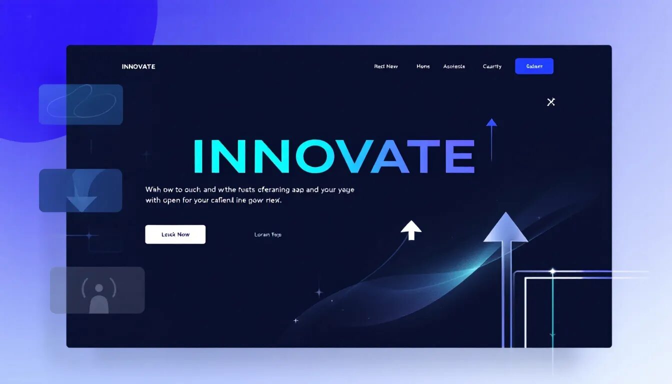
Visual elements are powerful tools that can enhance the effectiveness of your landing pages. High-quality images capture attention and build trust, making visitors more likely to engage with your content. A great place to show your product or service in action is the hero image section on a landing page. This visual overview can quickly communicate the value proposition and make your offering more relatable.
A hero image or video should contextualize the product or service, ideally featuring real usage scenarios. Resources such as Unsplash and Pexels can be used to find high-quality images for your landing pages.
Effectively utilizing visual elements creates landing pages that are not only visually appealing but also highly effective in increasing conversion rates.
Best Practices for Building Landing Pages
To build landing pages that convert, it’s essential to follow best practices that enhance user experience and drive conversions. These include keeping the focus above the fold, removing navigation and distractions, and incorporating social proof.
Adhering to these practices helps create high-converting landing pages that effectively guide visitors towards your desired action.
Keeping the Focus Above the Fold
One of the best practices for creating high-converting landing pages is ensuring that essential elements are visible without scrolling. This includes the main headline, value proposition, and CTA. Analyzing bounce rates and time spent on the page can offer insights into how effectively the landing page engages visitors and drives conversions. For instance, if visitors are leaving quickly, it may indicate that the key information is not immediately visible.
E-commerce landing pages frequently highlight limited-time offers to create a sense of urgency and encourage immediate purchases. Keeping important information above the fold captures visitors’ attention quickly and increases the chances of conversion.
Removing Navigation and Distractions
A landing page operates most effectively when it is designed as a standalone page, focusing solely on a single conversion goal. This means removing navigation menus and limiting links to prevent users from leaving before converting.
Minimizing unnecessary links and other distractions enhances the landing page’s effectiveness and keeps visitors focused on the desired action.
Incorporating Social Proof
Testimonials and social proof are vital components of landing pages, especially for SaaS and service-based businesses, as they significantly build trust and credibility. For example, including user testimonials with specific details like the person’s name, title, and photo can enhance the credibility of the testimonials and make them more persuasive.
Service-based landing pages leverage testimonials and social proof to build trust with potential customers. Incorporating social proof increases conversion rates by reassuring visitors that others have had positive experiences with your product or service.
Optimizing Landing Pages for Mobile Devices
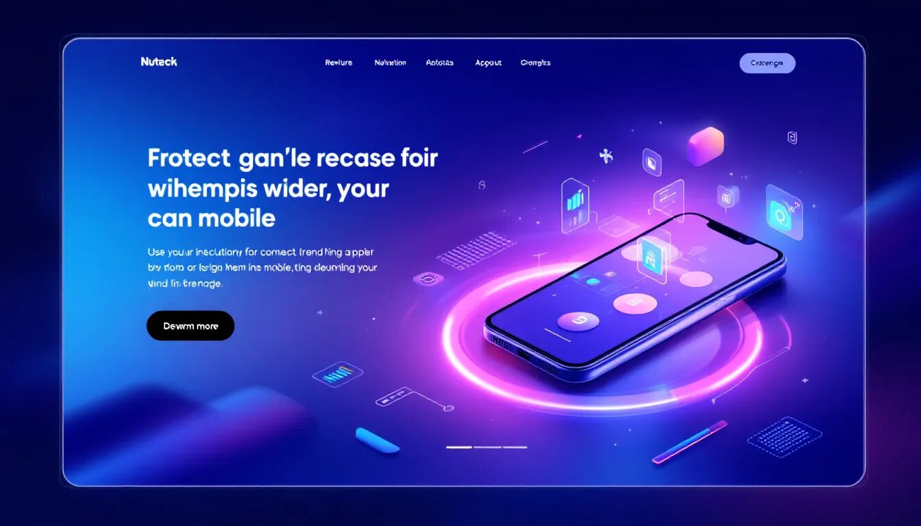
With the increasing use of mobile devices for internet marketing, it’s crucial to optimize your landing pages for mobile users. Mobile-responsive designs enhance user experience and boost conversion rates by adjusting content for various devices.
This section covers mobile-first design principles and simplifying forms for mobile users to ensure a successful landing experience.
Mobile-First Design Principles
When optimizing landing pages, the main emphasis should be on mobile design first. This approach ensures a better user experience on mobile devices. Studies show that 70% of consumers consider loading time when deciding to buy, emphasizing the need for swift page loads. A maximum loading time of 3 seconds is recommended for mobile landing pages to prevent user drop-off. For mobile landing pages, make buttons easy to tap to enhance user interaction.
Layouts must adapt to mobile by highlighting calls-to-action and minimizing image sizes. Using tools like Google’s Accelerated Mobile Pages (AMP) can significantly enhance page loading times. This helps deliver content at near-instant speeds. Following mobile-first design principles ensures that your landing pages work effectively on mobile devices.
Simplifying Forms for Mobile Users
Mobile forms should be concise to enhance usability and encourage submission. Use multi-step forms to reduce friction for long forms during completion.
Simplifying forms for mobile users improves the user experience and increases the likelihood of form submission.
Testing and Experimentation for Better Conversion Rates
Building, testing, and improving are crucial for landing page success. This section covers essential strategies for testing and improving landing page performance, including A/B testing basics and analyzing test results.
Experimenting and letting customers decide what converts best helps create landing pages that effectively drive conversions.
A/B Testing Basics
A/B testing involves comparing two versions of a landing page—one original and one variation—to gauge which performs better in terms of user engagement and conversions. A well-defined hypothesis is crucial for effective A/B testing, as it guides the changes to be tested based on user insights and past performance data. Tools such as Unbounce, Google Analytics, Hotjar, VWO, and LeadsRX can be utilized for A/B testing landing pages.
Understanding A/B testing basics allows you to systematically test variations and improve your landing pages’ performance. This practice is essential for increasing conversion rates and ensuring that your landing pages work effectively.
Analyzing Test Results
To assess landing page effectiveness, focus not only on basic conversion rates but also on visitor interaction metrics such as time on page, scroll depth, and form drop-off rates. Improvements in conversions can result from testing different copy text, form layouts, images, and background colors through multivariate landing page optimization.
For mobile landing pages, it is crucial to monitor page load time as a key metric to ensure user experience and retention. Analyzing test results helps identify areas for improvement and make data-driven decisions to enhance your landing pages.
Examples of High-Converting Landing Pages
Learning from real-world examples can provide valuable insights into what makes a high-converting landing page. This section presents examples of successful landing pages across different industries, including SaaS products, e-commerce stores, and service-based businesses.
These examples illustrate proven strategies and design elements that contribute to high conversion rates.
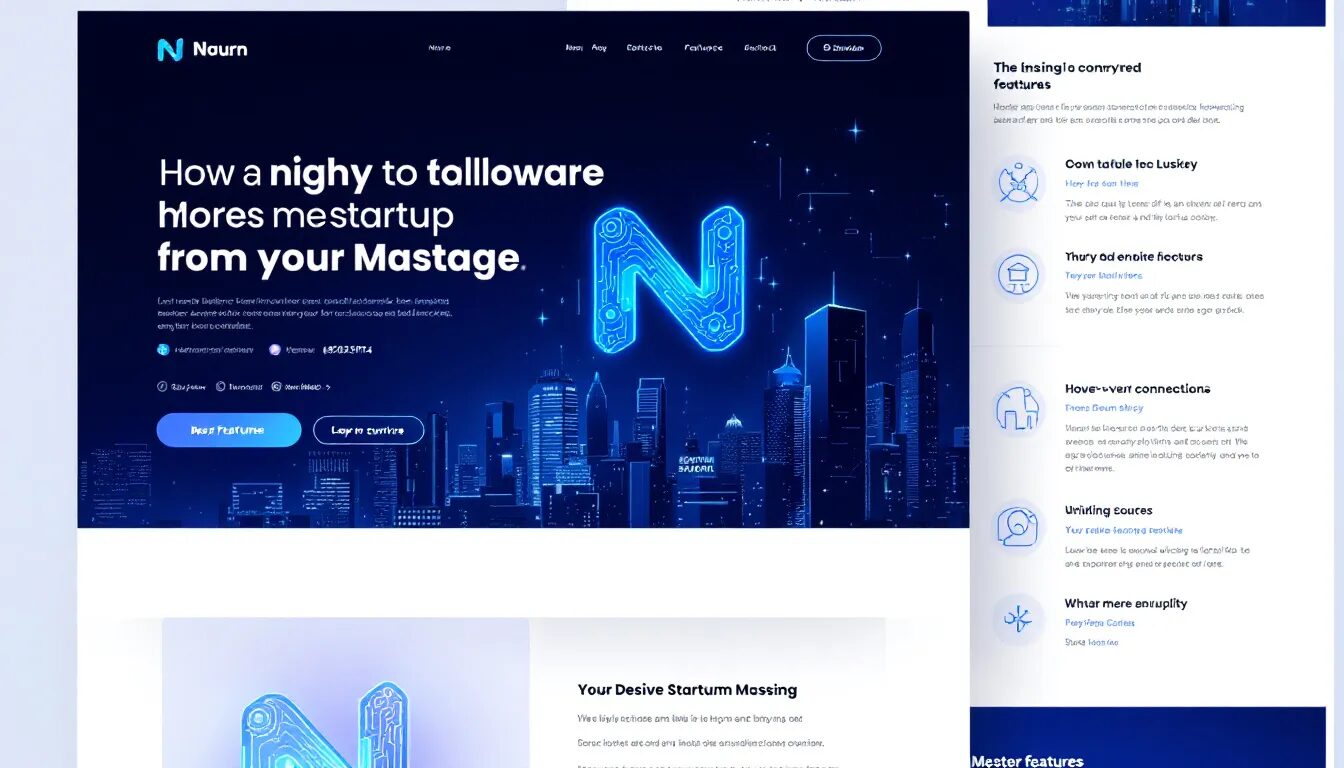
Example 1: SaaS Product
A SaaS product landing page utilizes gentle blue, pink, and white pastels, contributing to its aesthetic appeal. The colors suggest themes of cleanliness, which align with the product being marketed.
Customer satisfaction is prominently demonstrated at the bottom of the great landing page, conveying a sense of trust and assurance to satisfied customers. This is crucial for any search engine optimization strategy.
Example 2: E-commerce Store
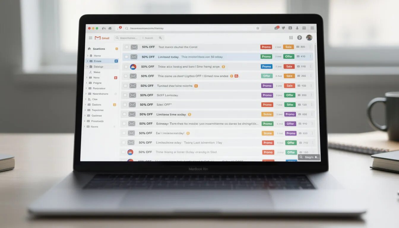
Amazon’s landing page is a prime example of how simplicity and user-friendly design can drive conversions. The layout is clean, using soft blue and white colors that contribute to a straightforward and welcoming interface. This simplicity helps potential customers find what they need quickly, reducing friction in the purchasing process.
In addition to its clean design, Amazon’s landing page features several product categories and emphasizes key attributes like fast and free delivery, which are significant drivers of conversions. By focusing on these elements, Amazon ensures that visitors are motivated to move further down the sales funnel, making it a highly effective e-commerce landing page.
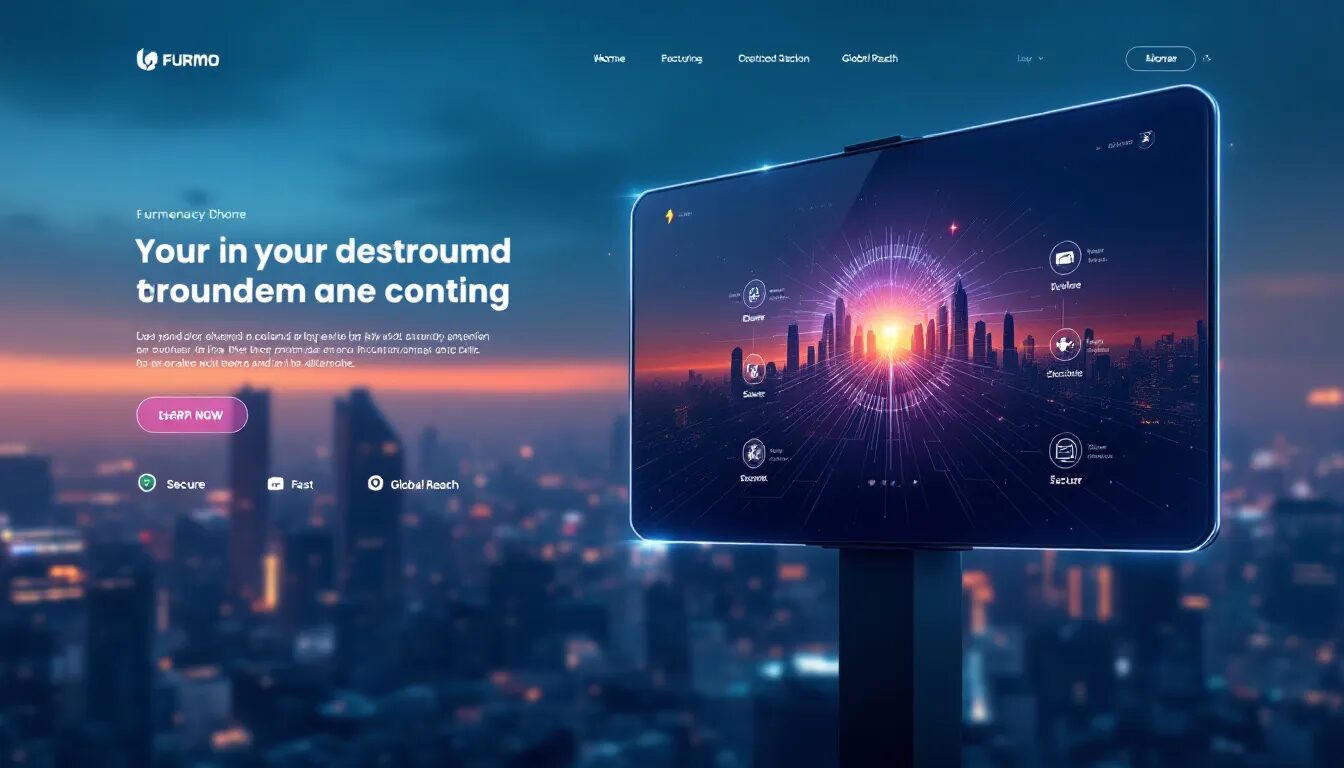
Example 3: Service-Based Business
For service-based businesses, a landing page with a deep red background can evoke hunger and draw users’ attention, increasing engagement. This color choice can be particularly effective for businesses in the food industry.
By coupling this with testimonials and clear calls to action, service-based businesses can create a compelling and high-converting landing page.
Common Mistakes to Avoid When Creating Landing Pages
Creating effective landing pages involves avoiding common pitfalls that can hinder their performance. Overloading with information, ignoring load times, and failing to align with ads are some of the critical mistakes to avoid.
Understanding these mistakes can help you refine your landing page strategy and improve conversion rates.
Overloading with Information
Visitors can feel overwhelmed by excessive content, making it crucial to maintain clear and concise messaging. Overloading a landing page with information can lead to decision paralysis, where visitors are unable to make a choice due to too many options. This can significantly reduce the effectiveness of your landing page.
Maintaining concise messaging is essential to ensure visitors are not overwhelmed and can navigate the landing page effectively. Clear and concise messaging helps in enhancing user experience by reducing cognitive load.
Avoiding information overload keeps your visitors focused and increases the likelihood of conversions.
Ignoring Load Times
Page load speed is critical for mobile landing pages to prevent user drop-off. Slow loading times can frustrate users, leading to higher abandonment rates and lower conversion chances. Over 50% of users expect a webpage to load in under two seconds, and delays can significantly increase bounce rates. A loading time increase from one to three seconds can raise bounce rates by up to 32%.
Implement optimization techniques to improve loading speed and keep visitors engaged. Focusing on load times ensures that your landing pages provide a seamless user experience and improve conversion rates.
Failing to Align with Ads
Consistency between ad messaging and landing page content is vital to meet visitor expectations and minimize bounce rates. When the messaging on a landing page does not match that of the corresponding ad, it can lead to a higher bounce rate and lower conversions. This misalignment can create a disconnect that leaves visitors feeling misled.
Ensuring alignment between ads and landing pages is critical for improving conversions and user retention. Aligning your landing page content with your paid advertising campaigns provides a cohesive experience that meets visitor expectations and encourages them to take action.
Summary
Creating a high-converting landing page requires a blend of strategic design and practical implementation. Key elements such as compelling headlines, effective CTAs, and engaging visual elements are crucial for capturing attention and driving conversions. Best practices like keeping essential information above the fold, minimizing distractions, and incorporating social proof can further enhance your landing page’s effectiveness.
Optimizing for mobile devices, regularly testing and analyzing performance, and learning from real-world examples are essential steps in refining your landing page strategy. By avoiding common mistakes such as overloading with information, ignoring load times, and failing to align with ads, you can create landing pages that deliver outstanding results. Remember, the goal is to provide a seamless and compelling user experience that guides visitors towards taking the desired action.
Frequently Asked Questions
How do I make my website a landing page?
To create a landing page, use a design tool like Canva to start with a customizable template, personalize the elements, and then publish your site. This streamlined process ensures your landing page is visually appealing and ready for visitors.
What is the primary goal of a landing page?
The primary goal of a landing page is to convert visitors into customers or leads by directing them towards a specific action. This clear focus ensures maximum effectiveness in achieving your marketing objectives.
How can I make my CTAs more effective?
To make your CTAs more effective, use specific and inviting phrases that clearly communicate the benefits of clicking, such as “Get Your Free Guide Now” instead of generic text like “Click Here.” This approach encourages user engagement and increases conversion rates.
Why is it important to keep essential elements above the fold?
It’s crucial to keep essential elements above the fold because this placement allows visitors to quickly access key information, enhancing engagement and improving conversion rates.
How can I optimize my landing page for mobile devices?
To optimize your landing page for mobile devices, prioritize mobile-first design, ensure fast loading times, and incorporate large, easily tappable buttons for a better user experience.
Want More Tips?
Looking for Check out our latest guides and resources to elevate your marketing game
© 2025, Vertical Response. All rights reserved.