Give Your Company Profile (aka ‘About’ Page) Some TLC
If you’ve got a website, you know that your company profile page (also known as your “about” page) is essential. This page answers the critical question nearly every new visitor and potential customer asks: “Who are you?”
When someone is thinking about buying from or engaging with your company, chances are they want to know a little more about you. The “about” section is an opportunity to highlight your history, personality, accolades and more. It’s a glimpse into your company beyond what’s on your product pages.
So why is it most corporate “about” pages seem cobbled together at the last second? Or so filled with superlatives that your eyes glaze over?
At the end of the day, people want to work with businesses they trust and are comfortable with. So show them who you really are! Here’s how:
According to Jeff Haden’s excellent Inc. article, “8 Ways to Improve Your ‘About Us’ Page,” padding your company’s description with high-falutin’ adjectives only tells readers that you know how to use a thesaurus. Any shmuck can call himself “innovative.”
Instead of telling readers how great you are, prove it with facts. Tell a story (but don’t write a novel). Share when the company started, who started it and why. Include photos from back in the day. List some (not all) of your biggest awards, company stats and any significant articles written about you in the press – this adds legitimacy to your claims. Name-drop some of your best or most well-known customers.
2. Have a Personality
Often, what closes the deal for a prospective customer is being a “good fit” – that intangible feeling of likeability. How can you show that you’re likeable? By highlighting your own unique writing voice … and the “about” section is a natural place to do this. Showing some personality on your company profile (and throughout your website in general) could be the ticket to landing business that would otherwise have gone to your competitors.
Take a cue from big companies like Zappos and Google. They’re known for being fun and a little off-the-cuff, and their “about” sections reinforce this; it says a lot about their culture and the way they approach their work.
3. Highlight Your Peeps
People want to do business with people, not name-less cogs. At the very least, show photos of your executive or leadership team (and include their Twitter handles); this is a great opportunity to put faces to names and let people know that you’re the real deal.
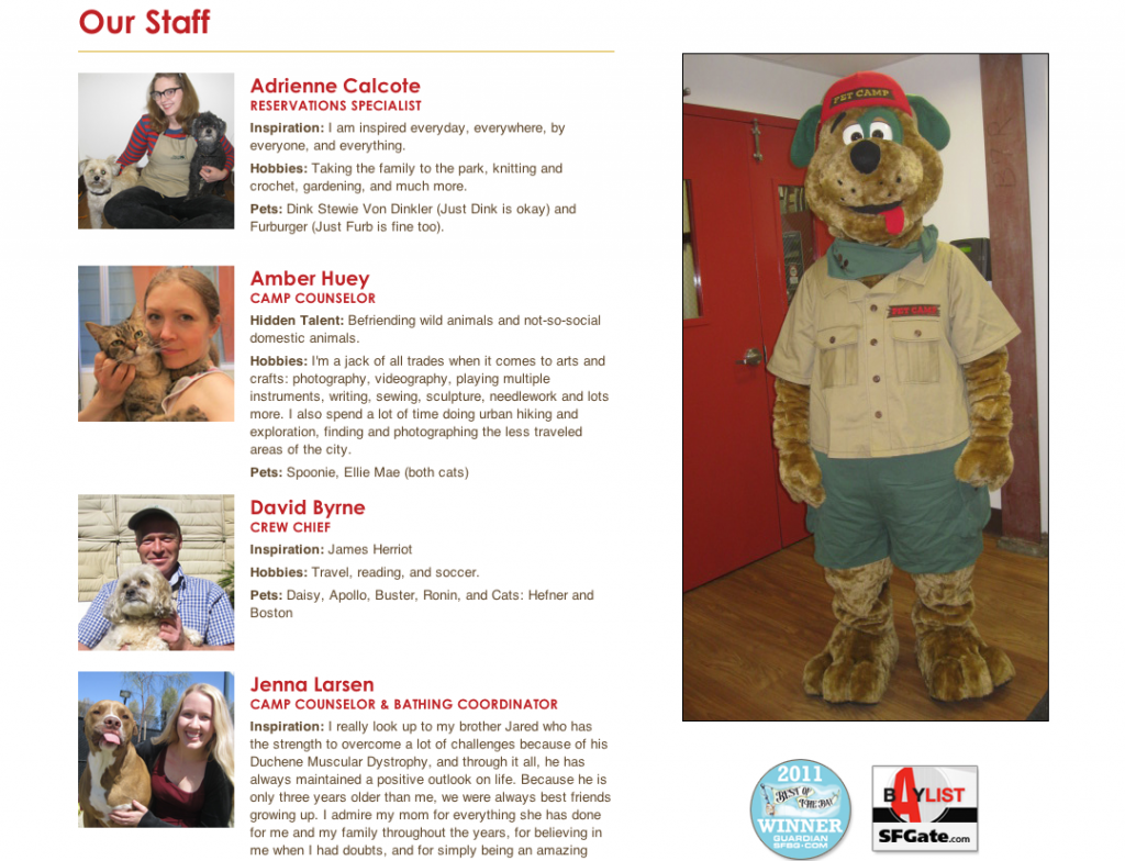
But why limit yourself to just the founder or owner? Include photos of the receptionist, driver and everyone else who contributes to the growth of your business. They’re just as important! While you’re at it, why not shoot a quick video of “a day at the office” and post that, too? One of our favorite customers here at VerticalResponse, a pet care business in San Francisco called Pet Camp, not only posts photos of their staff and camp counselors in the “about” section, but also their beloved pets, too. A picture is worth a thousand words, and no more so than online where attention spans are shorter than ever. (For more tips on how to use images online and on social media, download our free “You Oughta Be in Pictures” guide.)
4. Use SEO Best Practices
Include a couple of keywords that you think people will search when they’re looking for the products or services you offer. Link those keywords to their specific product sections of your website. This not only improves the user navigation experience, but gives your website a boost when it comes to search engine optimization (SEO), too.
5. Make It Easy to Find
Don’t bury the link to your “about” page at the very bottom of the home page in teeny tiny font, if possible. Considering it’s one of the most-visited pages of a company website, you want to make it easy for people to find – above the fold or in the main top navigation bar is ideal.
Also: If you don’t have a separate “contact” section, include all your contact information – address, phone number, email address, links to social media profiles, etc. – in your “about” page. Better yet, include a link to your “contact” page in your “about” page anyway, just in case.
Need some more inspiration to get those creative juices flowing? Check out https://bestaboutpages.com, a site dedicated to – you guessed it – the best “about” pages online. You’ll see some common themes: lots of personality, photos and bold text.
Have you come across some memorable company profile pages? How about ones that made you cringe? Share in the comments below!
© 2013 – 2018, Contributing Author. All rights reserved.


