Html Email Outlook Padding | The complete guide for email marketers
Nearly every email marketer has been there: your emails display beautifully on your iPhone, Android device or Gmail, but blow up when opened in Outlook. How frustrating to invest considerable energy into crafting an amazing email campaign, only to be flooded with messages such as “links not working” and “can’t see images” instead of an inbox full of orders!
Installed on millions of devices worldwide, Microsoft’s enduring email client has been a thorn in the sides of marketers and designers for more than two decades – and its contemporary counterpart Windows Mail isn’t much better. Both render HTML using Microsoft Word (though some older versions of Outlook use Internet Explorer), and both ignore code conventions that work perfectly in other email clients style display block.
We’ve been there, we’ve learned how to tame the beast that is Outlook, and we’re here to help. The following lists some of the most common problems with Outlook and how you can solve them.
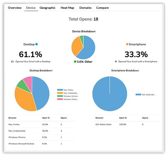
NOTE: This article is for intermediate to advanced coders who can write and read HTML without a graphic interface. If you’re not a coding maven – and you don’t want to pay one – you can take the easy route with a suite of tools from VerticalResponse. In addition to our popular email builder, we also offer the Email Test Kit, which shows you exactly what your emails will look like in nearly 60 different apps, browsers and devices before you hit “send.” That way you know your emails will display perfectly on all platforms and devices, including Outlook. You can also use our Advanced Reporting tool to gain insights into customer behavior, including which devices and browsers they use so you can be sure to design emails that properly render on those platforms.
Common Outlook problems solved
Here’s how to solve some of the most common email rendering issues in Outlook.
Background images do not display
Outlook will not display background images applied with traditional HTML. If you use a repeating background image, keep it monochromatic and apply a background color as a backup. Alternatively, you can use Vector Markup Language (VML) to force background images to display in Outlook.
Links display in the wrong colors
Outlook automatically makes all links blue (or purple, if they’ve been clicked), which might clash with your intended email design. Solve this problem by defining your link font color in-line.
Images do not display correctly
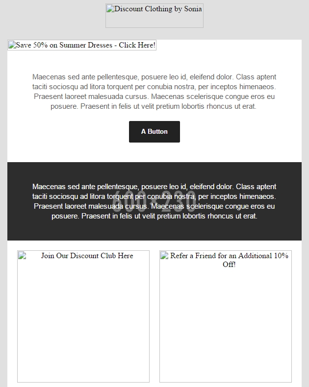
You can’t control whether a recipient blocks or allows email images automatically, but you can ensure your images are as effective as possible – even if they do not display. Be sure to add descriptive alt text to all images. Alt text renders even if images do not and tells people what your images are about. It can serve as calls to action that motivate clicks and even create desire that influences recipients to allow your images.
You should also account for retina displays by using images twice the intended dimensions. This will help avoid scaling issues that can cause your images to appear grainy.
The wrong fonts are displayed
Outlook will only display fonts installed on a user’s computer, so it’s best to stick to universal fonts such as Arial, Times, Helvetica, Verdana and Trebuchet. If you do want to use unique fonts, be sure to specify a fallback font that still works with your design.
Links aren’t working or displaying correctly
When you create links, be sure to use the full URL – including https:// or https:// – to ensure they work and display correctly in Outlook.
Animated GIFs do not work
Animated GIFs freeze on the first frame in Outlook. Unfortunately, there’s not much you can do about it, so if your audience is comprised of Outlook users it’s best to avoid using them. Note that modern versions of Windows Mail do support animated GIFs.
CSS does not render correctly
Like many email clients, Outlook struggles to render CSS coded within the <head> tag. Solve this by styling your HTML elements in-line.
Rounded corner buttons won’t display correctly
CSS can be used to display buttons with rounded corners via the border-radius property; however, Outlook does not recognize this property and will display rounded buttons as square buttons. Unfortunately, this is a limitation with no current solution.
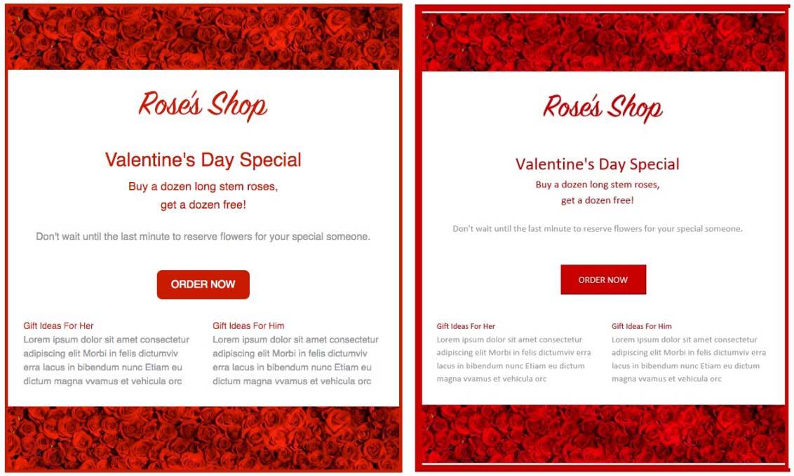
Table padding issues
Padding-top will be applied to all <td> tags in a row, even if you only add padding to one <td>. The simplest fix is to avoid using top padding on a row and instead add margins to elements contained within table cells to control spacing. Be sure to write the margin shorthand (margin: 0 0 0 0) rather than longhand (margin-top: 0px); otherwise, outlook 2007 margin left margins and padding 0 style html email style margin email template css padding white space align left td style padding border 0 div elements vertical spacing. you risk encountering other bugs. Another, less elegant solution is to add a one-cell nested table, then add padding-top to that.
The 1,800-pixel bug
Long emails such as newsletters can break at around 1,800 pixels in length. This is an Outlook error or bug that stems directly from its use of Microsoft Word as an HTML rendering engine: long emails are treated as multi-page Word documents and Outlook is attempting to add a page break. The fix? Keep your emails under 1,800 pixels long.
The layout is out of whack
If you created your email using divs with CSS properties such as float and position, you’ll likely find that your layout is completely off in Outlook. That’s because Outlook does not recognize those properties, so it’s best to use tables to compose your layout.
Table cell bug
For table cells with images shorter than 12px, be sure to apply height to them or face Outlook’s wrath. You should be specifying table height anyway.
Table strokes do not display correctly
If you add a stroke to a table that contains other elements, Outlook can add extra space/padding. Avoid using strokes if possible.
Line height disparities
Outlook can have issues with line height, especially if you specify line heights using a number such as 1.3 or if you set a line height less than one, in which case Outlook will crop your typography in odd ways. Reference this guide to avoid line height issues.
How to design emails for all platforms
Solving Outlook problems can be a headache even for seasoned coders. Not only do you need to address Outlook’s issues, but you also need to be sure any changes you make do not negatively affect how your emails render in other popular email clients such as Gmail, Apple Mail and Yahoo.
The good news is you can avoid the headaches and quickly design emails that work on all platforms with the Email Test Kit. Simply create a new email in the Vertical Response email builder and click “Run Test” to check the following for nearly 60 different email platforms:
- Inbox previews
- Subject line previews
- Links
If you discover an issue, you can make a change without ever leaving the email editor – and confidently send emails knowing they’ll display perfectly on all platforms and devices.
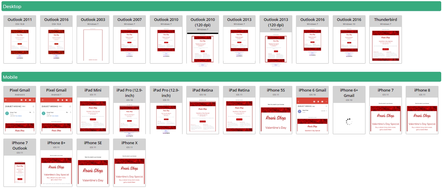
You can also save time with VerticalResponse’s Advanced Reporting tools, which show you which browsers and devices clients your customers use so you can ensure your emails render perfectly on those platforms.
With tools like these, what was once an extremely frustrating aspect of email marketing has become quick and simple. If you don’t want to hassle with tedious testing and jumping back-and-forth between your HTML editor and various email clients, you can save time, money and headaches by creating and testing your emails with VerticalResponse.
Build, send and track emails that look great on any device
Editor’s note: This guide was originally published in 2012 and has been updated and revised for accuracy and relevance.
© 2019, Brian Morris. All rights reserved.
 START YOUR FREE TRIAL

