Get Touchy: Mobile-Friendly Email Marketing Design Tips
Anyone with a smartphone undoubtedly uses it to check their email. In fact, according to Litmus, 44% of email is now opened on a mobile device – That’s up 63% from January 2012! And, since you can’t determine which of your emails will wind up on a small mobile screen, or that of a larger desktop, you need to design your emails to be easy to consume on both. While increasing font size is helpful, it’s just the first step in creating emails that work well on mobile screens. What else is a must-have when it comes to designing mobile-friendly emails? Let’s get touchy:
Simple works no matter what
While single-image emails may have made sense in the past, they’re dangerous in a mobile world: Android devices automatically block images (though users can change that setting), which will result in blank emails for many recipients. For those who can see an image, it’s rarely optimized for the varying shapes and sizes of mobile screens so users have to scroll, shrink or enlarge the image to get the whole message — something that many readers won’t bother with.
Brian Casel, a graphic designer, advocates for a simple approach to mobile-ready email design: “Single column, and very minimal to no design flair at all. This has the double benefit of being easy to read on all mobile devices, and doesn’t take away from the message, which really is the most important thing when it comes to an email newsletter.”
That doesn’t mean you shouldn’t emphasize calls-to-action or other text you want to bring readers’ attention to. But Casel points out that you can do a lot with font sizes or adding a large button — rather than over-designing the whole email.
A simpler approach has an added benefit on a mobile device: depending on where your reader happens to be located, downloading a graphics-heavy email may be a problem. Casel says, “If the email contains lots of heavy imagery and you’re on a slow data connection (which is common when you’re on the go), it can be very frustrating to wait through that spinning ‘loading’ icon.”
Interacting without a mouse
Users opening your emails on their mobile devices may be at something of a disadvantage: without a mouse to navigate with it’s easy to thumb the wrong link or button. If you’re including elements in your emails that you need readers to click on — even if they’re just links — an increase in size can be crucial, at least on mobile devices. You also need space between those clickable elements or you may find your readers accidentally clicking on the wrong link.
Most adults have fingers that are roughly 37 to 53 pixels wide, so your buttons and links need to be large enough that a finger can land squarely on them. As a general rule, about 40 pixels is usually wide enough. Adding in more space, so that anyone on the larger end of that range won’t accidentally click on the wrong button, requires a minimum of another five pixels.
Designing with mobile platforms and apps in mind
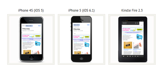
You need to make sure that your email design remains consistent across multiple devices. Android and iOS devices own the lion’s share of the smartphone market, with 50 and 40 percent, respectively. At the bare minimum, it’s worth testing your email designs on those two devices, as well as across multiple email service providers (Gmail, Yahoo, Hotmail, etc.).
Paying close attention to your readers’ responses is also a valuable strategy, according to Casel. Reading and replying to such responses can help you build a better relationship, but doing so can also help you catch and address problems early.
Mobile devices don’t have to be a headache for when creating your email, but considering how best to display your communications on multiple screen sizes should become a regular part of your email marketing program.
This post was contributed by guest author Thursday Bram. Bram has written for CNET, GigaOm, Lifehack and a variety of other sites. She can be found at thursdaybram.com.
© 2013 – 2018, Contributing Author. All rights reserved.


