Why a sign-up form is a no-brainer for email list growth
A list of contacts is essential for any business that wants to stay in touch with prospects and customers. That list also shouldn’t be set in stone. It should always be evolving thanks to adding new subscribers, attrition through unsubscribes, and email address abandonment.
In order to fuel continued and sustained list growth it’s a no-brainer to have an email sign-up form on your website, blog, and other digital properties like social media sites. By providing visitors a quick, easy, and efficient way to sign up for your email list, you can proactively grow your list around the clock. Having a solid email list is important because every dollar spent on email marketing generates $38 in ROI.
In addition, companies of all sizes count on email marketing for its many benefits including its positive impact on revenue. In a survey of more than 350 marketers done by The Relevancy Group for its report “The Relevancy Ring: ESP Buyers Guide 2015,” 37 percent of marketers attribute 20 percent of their revenue to email marketing.
So, if you’re not using an email sign-up form, you should make it a number one priority to do so. VerticalResponse provides sign-up forms for free with every free or paid account. Plus, we have a list of the top six places you should feature your sign-up form in order to grow your list, and a post chock-full of real-life examples of effective sign-up forms for B2B, B2C, and nonprofits.
If you’re using an email sign-up form for the first time, or you’ve been using one forever (good for you!), make sure you follow these three rules:
3 golden rules for sign-up forms
1. Don’t hide it:
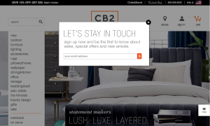
Don’t make people hunt for your signup form. If someone wants to subscribe to your newsletter or email list, put it front and center on your homepage (or across all the pages of your site) so it’s easy to find and fill out. Some of the most effective sign-up form real estate on your website will be the top right corner or across the top of the page. Also very useful (and very popular across the web) are sign-up lightboxes that appear on webpages. Take a look at retailer CB2’s as an example:
2. Explain the benefit:
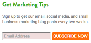
Provide some context and the benefit that a potential subscriber will get for handing over their email address. The last thing anyone wants is more email in their inbox, especially if it’s not going to have something in it for them. Tell them exactly what you’ll deliver and why they should care. For example, “Be the first to know about limited-time sales, find out about special guests, etc.” The CB2 example above is a perfect illustration of this. What CB2 doesn’t include, but which you may want to, is the frequency that your subscriber will hear from you. Will you mail once a week or once a month or daily? Tell them like we do in our VerticalResponse newsletter sign-up form.
3. Stick to the basics:
You might be tempted to collect heaps of information on your sign-up form to aid in the personalization of your emails, but try to resist this temptation. Stick to the basics like first name and email address. The more fields you add, the less likely someone is to fill it out, so only ask for what you need.
These no-brainer email sign-up form tips and examples will help you grow your email list easily and efficiently. Here’s one last idea: Don’t forget the power of old-fashioned pen and paper in your place of business. Sign-up sheets are incredibly tempting for customers to fill out, especially after you’ve wowed them with your exceptional products and services.
Build, send and track emails that look great on any device
Editor’s note: This post was originally published in March 2015 and has been revamped and updated for accuracy and relevance.
© 2016 – 2018, Contributing Author. All rights reserved.


 START YOUR FREE TRIAL


