3 reasons why you should write CTAs from the reader’s point of view
A strong call to action (CTA) isn’t just one of the most important elements of your email campaigns — it’s critical to the success of your overall online marketing plan. Whether you want your subscribers to make a purchase, visit your website or RSVP for an event, a compelling CTA can get the job done. While trying to create click-worthy CTA text, you may have experimented with the length of your copy, its tone and your word choice. But have you tried writing CTAs from the reader’s point of view?
Button copy is commonly written in the second person. You often see or write phrases like, “Buy now,” “Get started,” “Learn more” or “Schedule your consultation” in marketing emails. You’ll notice that all of these phrases are directed to the reader but, because they’re in the second person, are written from the perspective of the business sending the message.
A recent study showed CTAs that used the first-person voice had a 90 percent better conversion rate than CTAs written in the second person.
To create a first-person CTA (written from the point of view of the reader), you might consider using “Reserve my table” instead of the more traditional “Reserve your table” or “Make a reservation.” It seems like a minor change, but making the switch from using (or implying) “you” or “your” to using “I” or “my” could pay off big for your business.
Are you ready to change your point of view? Here are three reasons why first-person CTAs work so well.
Give the reader control
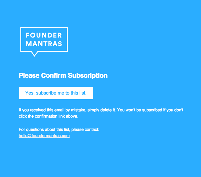
Whether you’re asking readers to share personal information, buy a product or learn more about your business, you want your reader to feel like they’re in control of the process. Using first-person language emphasizes that it’s their decision to click or not. This is especially useful when creating opt-in emails, like this example from Founder Mantras:
Increase personalization
According to an Experian study, personalized emails deliver six times higher transaction rates. From adding contacts’ names to subject lines or greetings, to segmenting lists in order to provide subscribers with the most relevant content, you may already be implementing some form of marketing personalization. First-person CTAs are one more way to create a reading experience that feels tailor-made for the individual, like this example from Havenly:
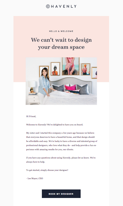
The CTA used in this email is “Book my designer.” Using “my” here creates intimacy and makes the process of finding an interior designer seem like it was designed specifically for the person reading the email. The reader isn’t booking “a” designer, they’re booking their very own designer. In this instance, you could say that the first-person copy creates a more personal connection between the reader and the service.
Add some variety
CTAs should stand out, and writing copy from the readers’ perspective can be attention-grabbing simply because it’s so unexpected. People are accustomed to seeing CTAs that are written in the second person. You can shake things up by inserting “my” where they’re used to seeing “your.”
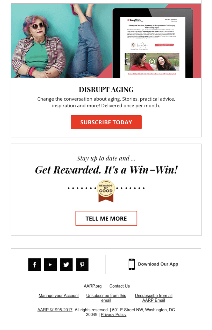
This example from AARP actually uses CTAs that are in the first person (“Tell me more”) and the second person (“Subscribe today”). In an email with multiple CTAs, varying the language like this makes each individual button stand out.
At first, it might seem a little unnatural writing from the readers’ point of view. But making the jump from the second person to the first person may be just what your business needs to improve clickthrough rates. As with any change you make to your email design, however, you should run a few A/B tests to determine what works best for your subscribers.
Join 140,000 small business owners
Editor’s note: Founder Mantras and Havenly email screenshots have been provided by Really Good Emails.
© 2018 – 2019, Amber Humphrey. All rights reserved.
 SUBSCRIBE