5 tips to improve nonprofit emails
It used to be that nonprofits relied on fundraising galas and direct-mail to solicit donations. But now, many nonprofits are using email marketing as a fundraising tool.
Email marketing accounted for 26 percent of all online donations in 2016, according to M+R Benchmarks, which tracks online fundraising and advocacy for nonprofits.
To maximize your marketing efforts, here are five tips to improve your emails:
1. Send a variety of emails
Nonprofits need donations and volunteers, but that doesn’t mean every email you send has to ask for support. You should send a variety of emails. From newsletters to gratitude emails, you want to engage with your audience:
- Welcome email: When a new contact signs up for your email list, greet him or her with a welcome email.
- Gratitude email: When you receive donations, make sure to thank each supporter with a gratitude email.
- Explainer video: Show your supporters what you’re working on by sending a link to a video that explains a new project or your mission.
- Newsletter: On a regular basis, keep your followers up to date with a newsletter.
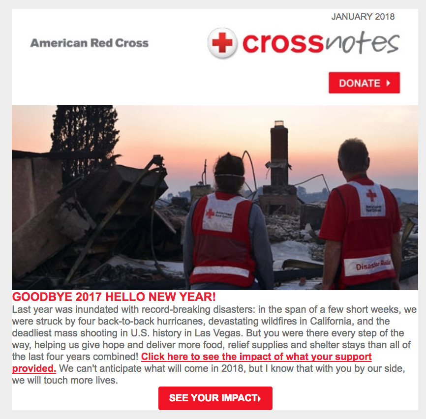
- Stewardship email: At the end of a campaign, tell donors how it went. For example, in Red Cross email below, the organization lets donors know how their support was used in 2017.
2. Vary your calls to action
Inevitably, you will send emails that ask for donations or support of some kind. Many nonprofits use “Donate Now” as the go-to call to action, but there are other phrases you can use that sound less like a plea for money. The next time you create a donation-based email, consider using a call to action from this list:
- Join Us Now
- Take Action
- Get Involved Today
- Join the Fight
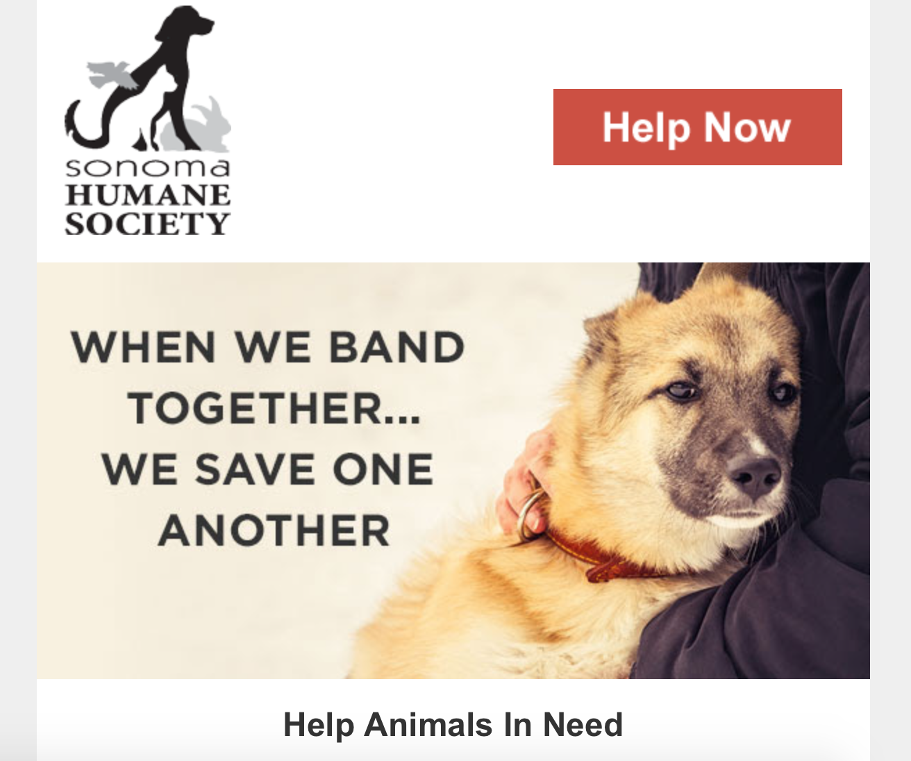
- Help Now
- Support Your Animal Humane Society (change to your nonprofit’s name)
- Give the Gift of Food (alter to fit the service you provide)
- Send a Military Care Package Now (alter to fit a specific package you provide)
3. Add an attention-grabbing image
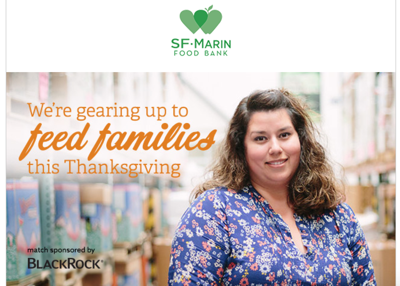
As a nonprofit, one of the best ways to encourage your audience to get involved is to show them how they can help. Supporters are more likely to help your cause if they can relate to it on a human level. Try to include an image that shows the need that your nonprofit meets or showcases what your organization has accomplished.
4. Select one or two readable fonts
When you create an email, you have a multitude of fonts to select from. To ensure your audience can read your email, select clear fonts. Stay away from typefaces that use symbols or hard-to-read scripted letters. You’ll also want to limit the number of fonts you use in each email to only one or two.
Here’s a quick list of go-to fonts that are easy to read across devices:
- Tahoma
- Times New Roman
- Trebuchet MS
- Arial
- Rockwell
- Gil Sans
- Cambria
- Helvetica
5. Pick a color scheme
Think of an email as an outfit. When you get dressed in the morning, you select colors that match or complement each other. The same is true for your email color scheme. Pick two (maybe three) colors to use throughout the email.
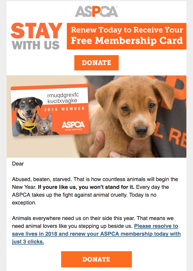
The ASPCA sticks with orange and gray, which helps their cute and fluffy imagery stand out and makes that all-important DONATE button pop.
With these tactics, your nonprofit organization will be sending even better emails in no time. Looking for even more nonprofit help? You’ll find it in this guide.
Join 140,000 small business owners
Editor’s note: This post was originally published in December 2014 and has been updated for accuracy and relevance.
© 2018 – 2019, Contributing Author. All rights reserved.
 SUBSCRIBE