6 Tips to Creating an Ideal Landing Page
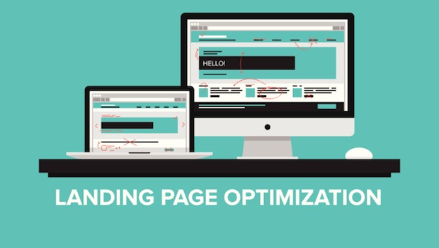
Having a well-designed landing page will go a long way when it comes to bringing in conversions. You could have the best product or service in the world, but if you don’t communicate that effectively, you could be missing out on new business. Follow these tips and best practices the create the ideal landing page for your business.
When creating a landing page, one of the first things you need to take into account is your purpose. According to Wordstream, some of the questions you should ask yourself include, “What is my end goal? Who is my audience? Where are they coming from?” How you set up or structure your landing page will be largely directed by what you want it to accomplish, such as new subscribers, to sales, and everything in between. With your purpose in mind, let’s dive in:
1) Keep it Short and Concise
Regardless of what your end goal is, you’ll want to keep your landing pages brief and concise. In today’s Internet age, you have a very limited amount of time to keep users engaged. By eliminating clutter and keeping things brief, you have less of a chance for users to be turned off or distracted and there’s a higher chance of having them complete the action that you want. Make users focus on what you want them to focus on by using design principles to guide them through the process you want them to take.
2) Stay Relevant
Maintaining relevancy and message consistency throughout your ads, landing page, and/or website is important. A visitor wants to see messaging that’s relevant to what they were looking for. If a visitor comes to your page and sees something they’re not expecting, they’ll quickly move off your landing page, may possibly search your site to find what they were looking for, but are much more likely to just leave your site all together. You’ll want to create a positive experience for anyone who comes and visits your site or landingpage.
3) Catch Attention with Your Headlines
You want your landing page to have a powerful headline or statement that gets a visitor’s attention. Generally, this is the first thing they see, and it should be used to draw them in. By stating your unique selling proposition, visitors should get a sense of what they can get out of your product or service. Additionally, you want to follow up that proposition with additional benefits as to why they should choose your product or service. If you choose to focus on features, describe the benefits versus just what your product does.
4) Make it Easy to Convert
You’ve gotten a visitor to your landing page, they’ve read your unique selling proposition and like what you have to offer. Now you need to lead them down a path with your purpose in mind. This starts with a clear call-to-action. By making the call-to-action prominent, perhaps by using a button or certain colors, visitors will know exactly what you want them to do. Eliminate distractions by limiting the number of options or decisions a visitor has to take. For example, if you want a visitor to sign up for a free trial, have a clear and prominent call-to-action such as “Sign up for a Free Trial Now.” In addition, it may be a good idea to offer some kind of promotion to further entice them to take the action you want. Keep all your important information and calls-to-action above the fold.
5) Be Mobile-Friendly
Make your landing pages mobile-friendly. Everyone searches and browses the internet from their smart phones and tablets, so it’s essential to create a positive experience regardless of the device. Whether you choose to create two separate landing pages for both mobile and desktop, or one landing page that works well on both is up to you.
6) Test!
After all is said and done and you’ve created your landing page, it’s time to test. No tips or advice should be followed blindly, as what works for one business doesn’t always work for others. You know your customers best, and therefore, landing page creation should always be followed up with continual testing. Whether you only test specific parts of your landing page, like the call-to-action, or you test two very different messages, your landing page will be better for it. By testing, you’ll be able to maximize the effectiveness of your landing page and will hopefully bring in more conversions.
Use tools like Optimizely to run a true A/B split test, or use a heat map product like Crazy Egg to get an idea as to what visitors are really focusing on.
Extras:
Trust – It’s important to build trust with your visitors. If you have positive testimonials or awards, it’s good to include them on your landing page so visitors can see that you have a reliable product or service.
Videos – Also a nice thing to have to showcase your products or services, but be careful not to distract users from the end goal. Also, if your video isn’t getting much interaction, change it with something more valuable.
Fast Load-Time – Make sure your landing page doesn’t take a long time to load. As mentioned, you have a limited time to get your visitor’s attention and if he/she has wait for your page to load, they may just leave.
These are 6 tips and best practices to consider when building your landing page. If you’re looking for some great examples of landing pages, check out KissMetrics‘ “Anatomy of a Perfect Landing Page” as well as this Unbounce list.
Have any other tips to add to our list? Share them with our readers in the comments.
Craving more marketing tips and advice? Get the VR Buzz delivered daily to your inbox.
© 2014 – 2018, Contributing Author. All rights reserved.


