How to use exit-intent Pop Ups to recapture abandoning visitors
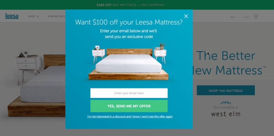
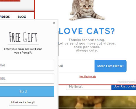
Exit-intent Pop Ups appear when your visitor is about to leave your site. The technology detects when a cursor moves to close a tab, moves to the address bar or hovers over the “X” to close the window. These actions trigger Pop Ups and give you one last chance to connect with your audience.
How to recapture through Pop Ups
VerticalResponse Pop Ups are a great tool to have at your disposal, but make sure you’re using them wisely. Follow these tips to make exit-intent Pop Ups work for you.
Do:
- Use a simple design with a healthy amount of white space — the blank areas surrounding the text, images or graphics. This will make it easier for visitors to understand the information in the Pop Up at a glance.
- Use an image that complements the text to lend trustworthiness to the message and grab attention.
- Create clear calls to action (CTAs) that attract the eye and prompt visitors to take action.
- Ask a yes or no question. This engages visitors. People are inherently risk-adverse and feel empowered when given a choice. Potential questions for exit-intent Pop Ups are along the lines of these: “Do you really want to leave?”; “Want a discount before you go?”; “Do you want to stay up to date on all the latest?” and so on.
- Make the benefits of signing up for your email list the largest part of your Pop Up.
- Using a discount to incentivize sign-ups through your Pop Up? Create a sense of urgency by adding an expiration date.

Don’t:
- Don’t crowd a bunch of words together that are difficult to look at, let alone read.
- Don’t forget a CTA. A Pop Up will not do any good if visitors don’t know what to do with it.
- Don’t create one-size-fits-all Pop Ups. Visitors have unique reasons for leaving, and how they respond to Pop Ups will vary. Experiment with messaging and try using different Pop Ups on a few of your site’s pages.
- Don’t be overly aggressive or pushy with the language on the exit-intent pop-up form.

Designing an effective exit-intent Pop Up
Now that we’ve gone through all the do’s and don’ts, you’ll need to create compelling content for your Pop Ups. Here’s how to get started.
- Begin with a clear benefit statement. Give the visitor a reason to continue engaging with your brand. Whether that’s more content, a discount or the promise of great emails being delivered to their inbox, the Pop Up should let them know the benefits of signing up for your list.
- Create an engaging headline to get noticed. Make it scannable.
- Use an offer that appeals to your audience. Don’t offer a free marketing e-book if visitors are trying to purchase pencils.
- Put it where they can see it. The center of the screen is a common choice.
Pop Ups are an additional chance to communicate and establish relationships. Their importance can’t be understated. From boosting sales to retaining customers who planned to leave, VerticalResponse Pop Ups, and especially exit-intent Pop Ups, can help your business goals. The longer visitors stay, the better chance you have of turning them into repeat visitors.
Join 140,000 small business owners
© 2018 – 2019, Lindsey Bakken. All rights reserved.
 SUBSCRIBE


