The 4 elements every event landing page needs
From product launch parties to community meetups, from holiday celebrations to webinars — events are an excellent way to build relationships with your customers. But before you can build those relationships, you must first reach your customers. Event marketing online is the key to engaging your audience and generating awareness. While most business owners lean heavily on email marketing and social media to spread the word, your digital promotion and marketing efforts can be amplified with landing pages.
A landing page is a targeted web page that is designed to prompt visitors to take a specific action. We’ve written a lot about how they can be used to collect leads, build your email list and generate revenue, but they’re especially useful when it’s time to encourage customers to participate in an event. To help you create a page that has the greatest impact, we’ve put together a quick guide. Before you publish your landing page, make sure to follow these four tips.
Don’t underestimate the power of design
It’s no secret that consumers prefer to engage with beautifully designed content. So spend some time thinking about the look and feel of your landing page.
All images should be high in quality and complement your messaging. Your layout should be uncluttered and easy to navigate.
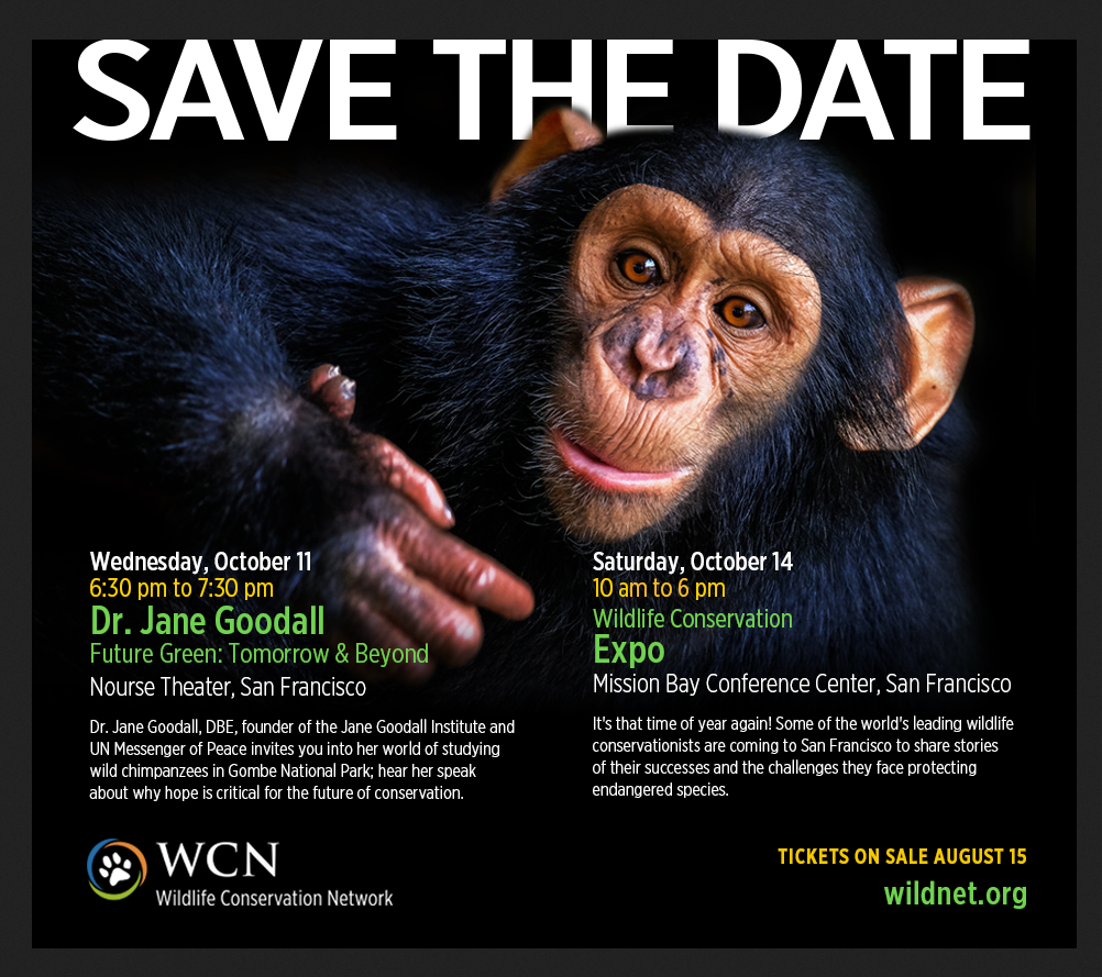
The Wildlife Conservation Network created a very simple but striking landing page to promote their annual conference and an upcoming talk by Jane Goodall. The image is striking and high quality, and it aligns with the message. It also demonstrates that the design need not be elaborate to be effective.
To really make your page pop and resonate with visitors, consider using a color scheme that thematically matches the occasion you’re promoting. Are you throwing an in-store anniversary celebration? Then vibrant, multi-colored graphics would capture the spirit of the event. Hosting a company webinar? Use your brand colors and logo.
Your landing page will set your readers’ expectations for the event. As the copy explicitly communicates the “what,” “where” and “why” of the occasion, the design establishes the tone. So if you want to entice your audience and get them excited about what’s to come, make sure that your landing page is visually appealing.
Limit your focus
As you’re building your landing page, you may be tempted to include background information or news about your company that isn’t directly related to the event. But it’s important to remember that landing pages are an effective tool because they have a specific objective. While your business’s website provides visitors with a comprehensive understanding of your organization and serves multiple purposes, a landing page is designed to tightly focus your audience’s attention on a particular goal, such as encouraging them to RSVP to your event.
Do not include irrelevant links or content that distracts visitors from taking the desired action, like filling out that RSVP form. You maximize the impact of your page if you stay on topic, presenting readers with the most pertinent details, such as the time of the event, the date, the location, the schedule or performers list, an explanation of the occasion and anything else that might encourage them to attend.
Have a clear call to action
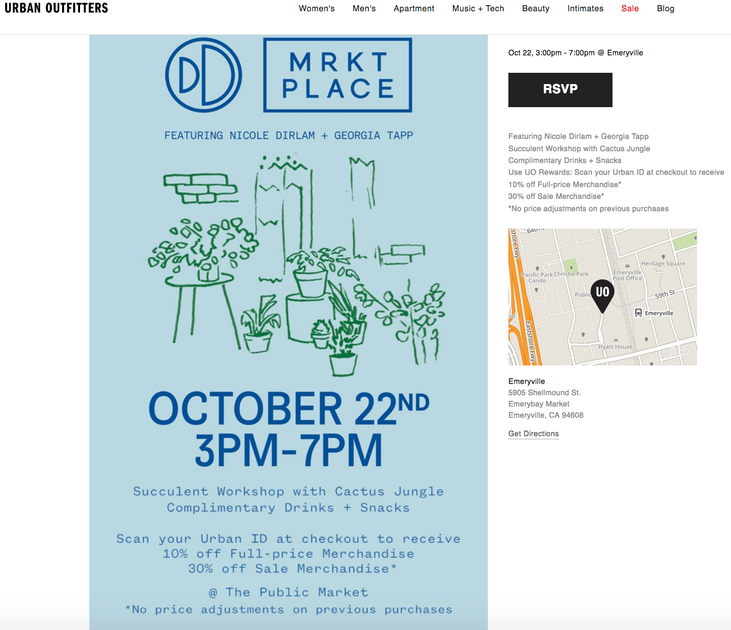
Once your audience lands on this event page, what do you want them to do? Would you like them to register for the event? Buy tickets? Sign up to your email list to get notifications? Before you design your page, develop a clear goal. Once you figure that out, it’s critical that your messaging be direct and easy to understand. In this example from Urban Outfitters, the prominent RSVP call to action at the top of the page makes it obvious what the reader is supposed to do.
Let your audience know how they’ll benefit
Convey the value you’re offering by using copy that’s plain and concise. In just a few words, the above example from Urban Outfitters does a good job of showing how attendees will benefit from the event. Not only will they get to learn something at this workshop, but they’ll also receive a discount on merchandise and complimentary snacks. Of course, it isn’t necessary to offer monetary compensation or free food. The value that the event provides could simply be the speaker at the venue. But whatever that benefit is, if you’re direct about it, your message will have more impact.
It takes a lot of effort to organize and launch an event. But you can make the promotion process easier with a well-designed landing page. VerticalResponse’s Landing Page creator makes it a snap to build and publish these vital marketing tools, often within minutes. If you follow the guidelines above and focus on incorporating the essential details into your VerticalResponse Landing Page, you’ll generate awareness and leads – and set the stage for a successful event.
Build, send and track emails that look great on any device
© 2017 – 2018, Amber Humphrey. All rights reserved.
 START YOUR FREE TRIAL