Tips and Tricks For Call-To-Actions
Emails live and die by their calls to action (CTAs). A good email marketing call to action is critical to success; it’s the catalyst that spurs sales. CTAs have evolved over the years, and keeping abreast of current trends is a great way to ensure your email marketing is effective. To that end, here are contemporary tips for crafting powerful email CTAs plus examples you can use to yield better results.
Begin at the end
The call to action should be the first thing you write when you draft a new email campaign. That’s because the entire goal of your email is to get readers to click your CTA and take the next step in the purchasing process.
When you write your CTA first, it’s easy to design the rest of your email to draw readers’ eyes to your call to action and motivate response.
Think of your email as a journey. Your subject line entices readers to open your email. Your body copy and images work to create desire and excite potential customers. Your email call to action is the natural next step and when everything is in sync, readers will be looking for it because they’re ready to act. That action doesn’t necessarily need to be a sale, though that is likely your end goal.
Foster your audience
A series of emails might work to foster trust and therefore include different types of CTAs in each installment. For example, the first email might invite subscribers to learn more about your company’s mission, so your CTA could be a “learn more” button. The second email might lend social proof, so your CTA might lead to your website’s press page. The third email, then, might promote a special discount offer with a CTA to “shop now.”
In the first of our email call to action examples, you can see how Grow.com (below) uses a CTA that invites readers to download a free cheat sheet. They’re not asking customers to buy now, but their end goal is still a sale: They want you to read the cheat sheet and be motivated to try their service.

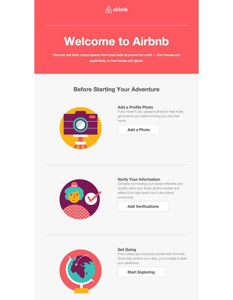
The below example from Airbnb illustrates how CTAs can be used to introduce readers to your community. It invites engagement and direct interaction without being overly promotional. Of course, the end goal is to land a sale and convert lifelong customers. Note how the email incorporates multiple CTAs.
Single vs. multiple email calls to actions
Some marketers feel a single call to action is the best strategy. The logic is that a single CTA allows you to focus your email content on achieving a singular goal, while multiple CTAs can be distracting. With too many options, subscribers aren’t sure what to do next and they ultimately delete your email without clicking anything.
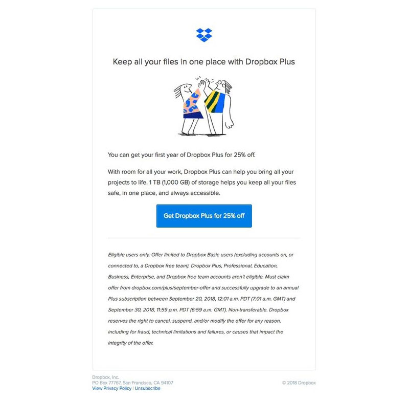
In this example, Dropbox uses a single CTA to drive clickthroughs:
The single-CTA strategy is sound, but there are times when multiple CTAs can be incredibly effective. In fact, multiple CTAs can add personalization to your email and increase your clickthrough rate.
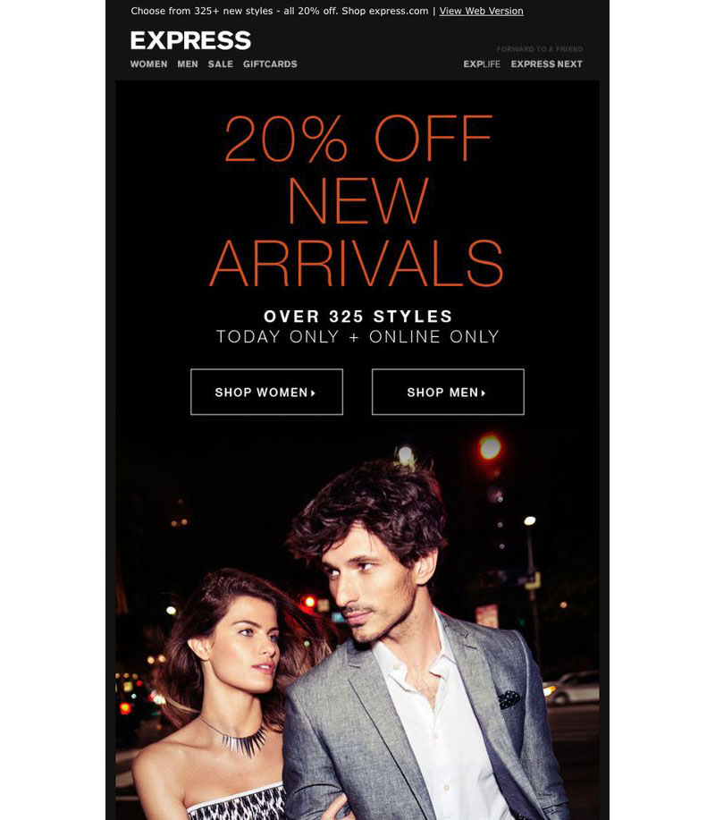
Let’s say you operate an online clothing store. You want to send an email that promotes a special time-limited discount. Your customer demographics include men, women and parents of young children. If you have multiple email lists segmented by those demographics, a single CTA in each email might be a good idea. However, it’s unlikely your lists are segmented like that, so instead you can offer three CTA buttons: “shop men,” “shop women” and “shop kids.” That way your subscribers identify with the CTA that best fits them and can quickly click to see the products they’re most interested in.
Here, Express uses multiple CTAs for men and women:
Another example? Let’s say you have many different types of products: shoes, jackets, shorts, etc. One option is to assign each its own CTA. In this email, Ruche uses multiple CTAs to appeal to shoppers interested in different product types:

This strategy can apply to many different types of businesses. Run an online pet supply store? Add different CTAs for dog lovers and cat lovers. Sell automotive accessories? Add different CTAs by accessory type or vehicle make.
You have options as you build your CTAs. The best way to know which work best is to test them, which leads us to our next point.
A/B test email marketing calls to action with a CTA-test matrix
Data-driven marketing is the best way to fine-tune your emails and consistently improve results. You can run split tests, or A/B tests, to see which email variants perform best. It’s easy to do with a CTA-test matrix.
With a CTA test, you identify a goal and test different versions of your email to see which yields better results. For example, you might wonder whether an email with a single CTA or multiple CTAs will perform better. In most cases, though, you’ll be testing a single element: which color button gets the most clicks, which button text works best and which button placement performs better.
Map the results in a table to make design decisions that improve your email click rate:
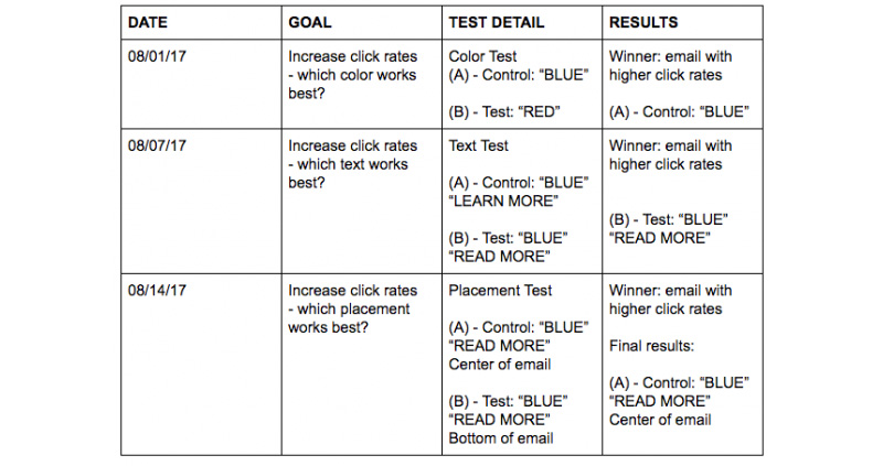
In the above example, you can see that on 8/1/17 we ran a test to see which button color increased click rates. Blue was the control (A), which means it was the color that was already being used. Red was the test (B). The results? The control won, so we’ll continue to use a blue button in that email.
In the second test, on 8/7/17, we tested the text “Read More” versus the control “Learn More.” In this case, the test beat the control. Since “Read More” won, it will become the control and we can test other variations against it to see if we can find one that performs even better.
Develop email CTAs from the reader’s point of view
Many email marketing CTAs use the second person point of view. For example:
- Subscribe Now
- Claim Your Prize
- Shop Now
- Learn More
- Reserve Your Table
However, studies show that the first-person voice yields a 90 percent better clickthrough rate than second-person voice. First-person lends the impression that the reader is in control and adds a level of personalization to your call to action. For example:
- Sign Me Up
- Claim My Prize
- Find My Perfect Style
- I Want To Know More
- Reserve My Table
See the difference? It’s easy to shift your calls to action to first-person perspective: simply replace “you” and “your” with “I,” “me” and “my.”
Give it a try. Chances are you’ll realize a significant boost in clickthrough rate.
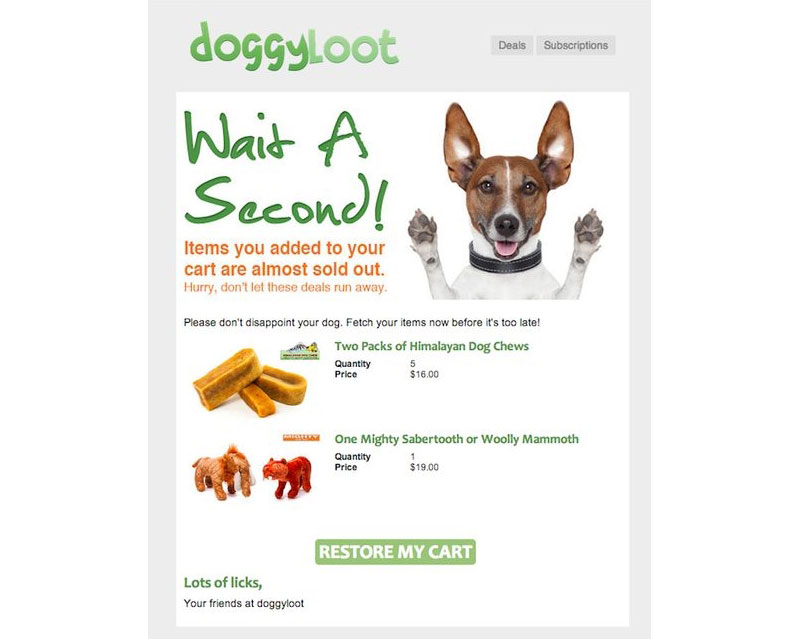
Here’s an example abandoned cart email from DoggyLoot that uses first person perspective to encourage subscribers to check out:
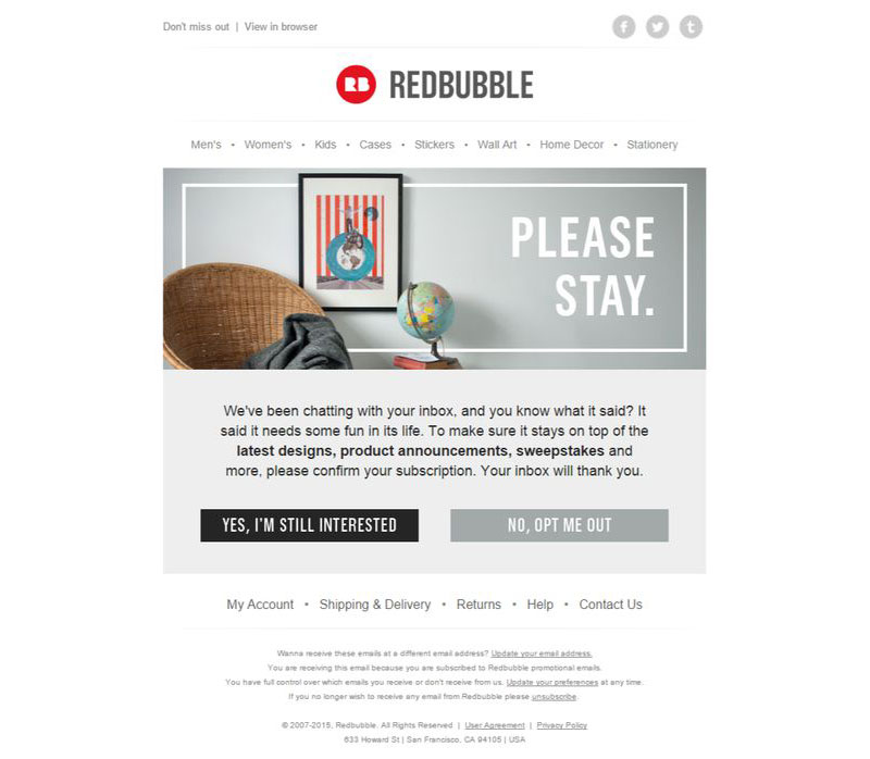
This tactic is used again in this opt-in/opt-out email by Redbubble:
Use power words (and have some fun with it)
Your CTA verbiage should reflect the message of your email body copy. Remember, a good CTA is a natural and expected next step in the email journey. Use your body copy to create desire, stir emotion and lend personalized meaning to your message; then, use your CTA to spur readers into action.
Use your test matrix to see which CTAs perform best. Not sure where to start? Try any of these proven CTA power words:
- Shop
- Contact
- Save
- Reserve
- Find
- Discover
- Free
- Buy
- Join
- Upgrade
- Now
- Get
- Claim
- Book
- Create
- Give
- Explore
- Add
- Try
- Sign Up
- View
Another contemporary email marketing CTA trend is to have some fun with your button copy. Instead of using a common CTA like “shop now,” this call to action by Rent The Runway reads “get the party started.”
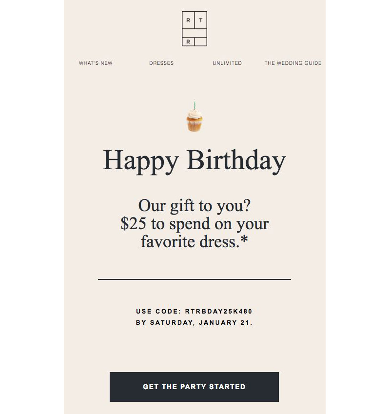
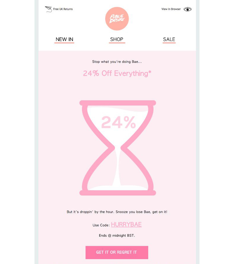
Here’s another fun example by Public Desire: “Get it or regret it.”
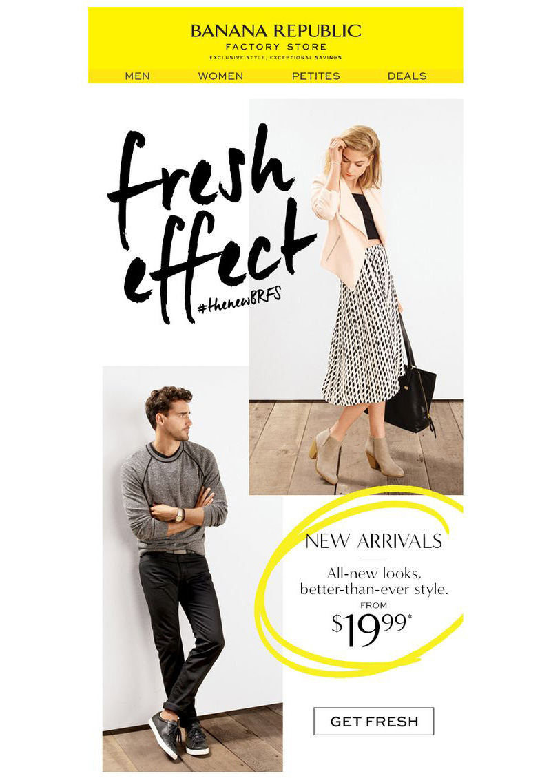
And another one by Banana Republic: “Get fresh.”
In conclusion, Your email call to action plays a major role in the success of your marketing strategy. Use these tips to craft modern email CTAs that increase clicks, generate leads and boost sales.
If you want to learn more about marketing, check out the rest of our blog. If you’re ready to start making content, sign up for a free trial to get the tools you need to make great marketing campaigns!
© 2023, Vertical Response. All rights reserved.


