What Gmail’s New Grid View Means for Your Emails
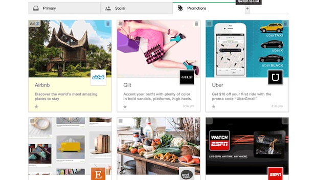
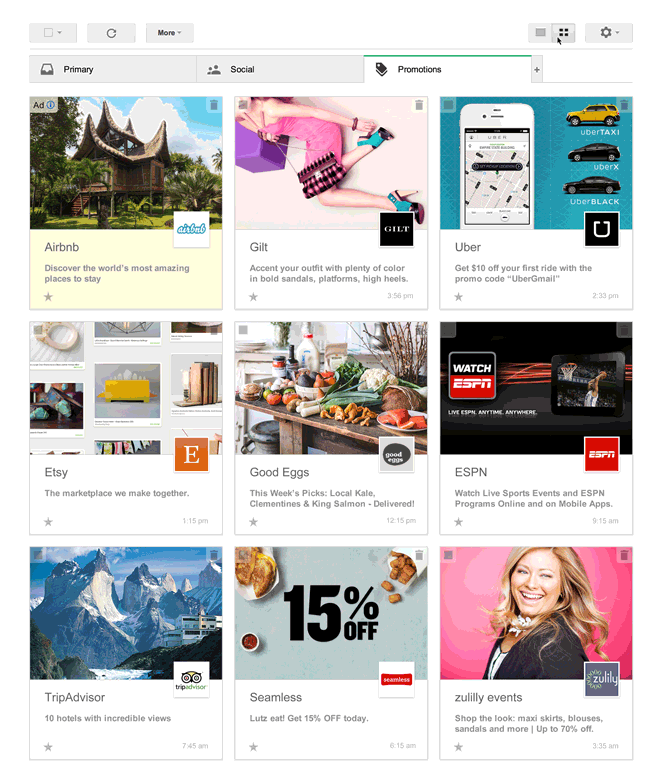
Google is at it again. Just one year after the email-giant organized the inbox into tabs, the company is rolling out another change. This time Google wants to transform the landscape of promotional emails. The company announced plans to nix their list-based look and turn the promotions tab into a Pinterest-like grid. Here’s how it’ll look:
So, how could this change the emails that you send for your business? Before we dive into the specifics, we should point out that Google is only testing this look right now. It’s not a done deal, but many marketers, like Kelly Cooper with ShopIgniter, expect it to test well.
“If we’ve learned anything from social networks, it’s that users interact more with rich content like photos and video over text, so the move to a more engaging view could create some great opportunities for marketers to make content that stands out,” she says.
If Google gives the grid view a green light, here’s what you should know:
Visuals rule
The images you select for your emails will be more important than ever. The premise behind this grid view is to show off some eye-candy. Think about what catches your eye when you’re scrolling through Pinterest or other social networks. Vivid pictures tend to grab your attention, right? You’ll want to approach your emails with the same kind of visual mindset.
Picture size matters
You’ll need to familiarize yourself with the formatting requirements, one of which is the size of the featured images. All featured images, the ones that show in the grid, must be at least 580 pixels x 400 pixels. You can use GIF, PNG or JPEG images. Animated GIFs can be used but the system will treat them as static pictures.
Character limits for sender names and subject lines
In the new format, the sender name or from label is limited to 20 characters, which shouldn’t be a big problem. That’s plenty of room for your company name, or who the subscriber expects to hear from.
The subject line is limited to 75 characters, which is about the same amount of space you have for a subject line in a regular email. However, with standard emails, a lot of businesses have perfected the art of short subject lines, about 50 characters or less. With this new view, however, some say it would be a waste of prime real estate to write short subject lines. We’ll find out which school of thought is right when small businesses run A/B tests on subject lines in the new grid view.
Sender picture pulled from Google+
A picture of the sender will also show up on this new grid view. In an attempt to get you to use all things Google, the picture comes from your company’s Google+ account. So, if you don’t have a Google+ account for your business, now might be a good time to set one up. Here’s a Google+ guide to get you started.
Sign up for the test view
There’s no word on how long Google plans to test this new view, or when it could be implemented, but you can sign up to give it a test drive. Right now this is only for emails read on a desk top, anyone seeing your emails on a mobile device will still see the standard list view. Since about 50% of emails are read on a mobile device, this means only some of your emails will be seen in this new format. Also this is only for emails that go to the Promotions tab in Gmail, if your email shows up in the Primary tab, for example, it will still be in the standard list format. And finally, even when this has been rolled out, Gmail users can toggle this view on and off, so it’s possible your emails will only be seen in this format by a handful of people.
What do you think of Google’s new grid view? How do you think it will impact your email marketing?
© 2014 – 2018, Contributing Author. All rights reserved.


