The Pros Dish: Email & Website Design Tips

Email Design
What are the three most important things to remember when designing an email?
1) The most important thing is to make sure your design is clean, uncluttered, and easy for the viewer to scan. Think bullet points, images that are relevant to your message, and a good balance of images and text. Keep images, text, and buttons on a grid so everything remains aligned. Remember: Keep it simple!
Rookie mistake: Not enough white space. Breathing room is a good thing!
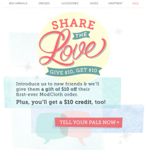
2) Include a clear and easy-to-find call-to-action, preferably in the form of a button. What do you want your reader to do as a result of receiving your email? Make it super-easy for them to take that action. If they’ve got to hunt around for a link or type in your URL, chances are you’ll lose them. If you want them to visit your site, a large “Visit the Site!” button makes it easy.
Rookie mistake: Only including your call-to-action in only one spot and/or forgetting to link it!
3) Consider your use of images, colors and fonts wisely. Use appealing color contrasts; bold and/or jarring colors might grab attention, but may not result in a positive reaction! Use fun, but clean and easy-to-read fonts. Also use a hierarchy of text: Include a clear, bold headline, then a smaller sub-headline, etc. Use visually pleasing, appealing and compelling images and/or illustrations. Keep popular sites like Pinterest in mind. Would you “pin” that image?
Rookie mistakes: Using too many typefaces or fonts – stick to one or two max; Combining photography with illustrations – use one or the other.
I know a lot of people read their email and look at websites on their mobile devices. How do I incorporate mobile into my designs?
First, make sure your content is succinct. Don’t be afraid to scrupulously edit yourself. Mobile users have even less time than desktop users to read your message. Second, choose a simple layout (one or two columns) that’s easy to scan. Keep in mind that it’s easier for mobile users to scroll vertically than horizontally, so long layouts are better than wide ones. Third, make your email touch friendly. Put your your calls-to-action on a button (we’ve got a handy free tool for that), instead of just a text link (easier for touching), and keep your links large and easy to click.
Is there anything I can do in the design of my email to avoid the spam folder?

- Use clean HTML (i.e. nested tables and closed tags).
- This isn’t necessarily design, but of course, always avoid spammy words and phrases, include an unsubscribe method, valid links and a postal address, as well as a clear “from” label and an accurate subject line.
What do most people forget when designing an email?
It’s important to remember that there is a person on the other end of your email. Ask yourself the following questions: “Would I like this email? Is it visually appealing to me? Is it enticing? Is it too cluttered? Do the images make sense? Is it too long or wide? Does it grab my attention? Do I know what action to take in this email?” If you answer “no” to any of these questions, try again. If you aren’t pleased with the design or purpose of the email, your customers won’t be either. And, have others take a look at your email for 10 seconds, then ask them what they remembered from the email. If it doesn’t match what you were going for, you may want to go back to the drawing board.
Web design
I already have a website, but it could use some improvement. What are some common mistakes you see on websites?
- Too much clutter. A lot of websites, and particularly homepages, struggle with too many messages at once. You’re awesome, and you want people to know all the awesome things you do, but focus on your main selling point or mission, and make it clear on the homepage. Once you’ve convinced your visitor to stick around, they’ll be happy to click further into your site to get more details, or learn more.
- Lack of a clear call-to-action. This seems to be a theme with both email and web design. Don’t be afraid to tell people what you want them to do: Shop now? Register for a webinar? Request more information? Whatever it is, make it easy for them.
I don’t have the skills to design my own website. Do you have recommendations that can help me work with a designer?
You could use a service like Wix, which makes it pretty easy for the less tech-savvy of us to create good-looking websites. Or, you can find sites you like and see who designed them, or do a search for a freelance designer on Elance or Odesk and look at the reviews.

- Apple of course, is king of being clean, clear and visually appealing.
- Warby Parker is sleek, classy and simple, just like their glasses.
- Join.Me is simple, yet sucks you in.
- Appsbuilder makes it look really fun and easy to create your own mobile app.
- Mint.com uses bold images and a simple design with a prominent call-to-action.
- Airbnb is simply stunning, beautifully designed, and extremely easy to navigate. You can easily browse this website for hours.
- Kickstarter is fun, clean, and extremely informative.
That’s our take. Have any of your own your best tips for email and web design? Share away!
© 2013 – 2018, Contributing Author. All rights reserved.


