Business Cards: The Good, the Bad, & the Ugly
Handing out business cards is essential for networking, building brand-awareness and gaining potential new customers. At VerticalResponse, we consistently attend trade shows all over the country, so we see a lot of business cards. But get this: Around 75% of the people we chatted with at the last trade show didn’t have business cards on them at all. What gives? Business cards can be one of your best marketing tools, so having one to begin with is vital.
Once you’ve got a card in hand, use these aspects from the good, the bad, and the ugly business cards we’ve come across to spruce yours up or tone it down. All sample business cards are innocent until proven guilty and certain images have been withheld to protect the identity of the individuals and businesses.
The Good
The basics to creating a good business card includes readability, valuable content, and what sets you apart from other businesses. There should be a hierarchy of information and the most important information should be the largest.
What are some business card must-haves?
- Logo
- Business name (if it isn’t clear in your logo)
- Your name
- Your title
- Phone number
- Company website
- Email address
- Social media handles
- A design element that makes you stand out from a stack of other business cards, like a unique color, or specific font.
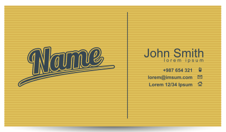
Check out Mark’s card below that I received recently. It’s a very simple design, but it contains all of the information you need to reach him. His logo is largest with his name highlighted in a larger, blue font. He even used his twitter handle as an added bonus. The one thing I would add, is what SIGNAL does or is as a business.

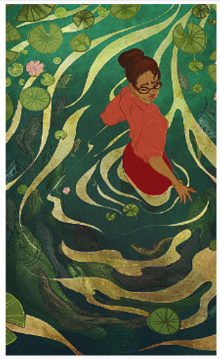
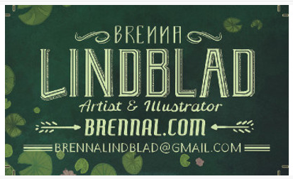
This business card comes from our sister company, PSPrint. It’s a piece of artwork. Can you tell she’s an artist and illustrator?
You should also consider what type of paper weight and finish to use. There are several choices, so take a trip into your local printer and feel the paper. If you’re using an online printer, or website service, you can request a sample packet (which are usually free) to make sure you’re picking the paper you like.
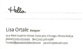
The example I also received below is very simple, however, it was printed on beautiful, matte heavy weight card stock that felt luxurious. There’s also a fair amount of white space that helps direct your eye to the important info, or even allows you to write notes.
Which kind of paper represents you and your business without going over budget? Check out these cool designs from PSPrint that are “hot off the press.” It might give you some new and exciting ideas for your next business card.
The Bad
The worst business cards that have landed in our trade show fish bowl have contained one or more of the following no-nos, but we tell you how to fix ’em too.
- Zero contact information – Make sure to include at least your business name, your personal name, phone number, and email address.
- Unreadable fonts – Here are the top 10 notoriously hated fonts that you should try to not use. The fonts on this list are either over used or hard to read.
- Too many font choices/sizes – Limit yourself to 2 fonts and 3 font sizes. Most printers have templates that you can use. While it’s nice to have this as a starting point, make sure to add your own flare.
- Unprofessional head shots or pictures – If you want to include your image on a business card, get a professional head shot taken and ask a friend if it represents you as your business.
- Information overload or too busy – Allow some room for white space (please see Lisa’s card above).
- Boring – This is all relative, but you should make your business stand out. Even simple designs (please see Mark’s card above) can be interesting if you use the proper font choices and font sizes for your business.
- Typos – Use spell check and have your card double checked by a friend or colleague to make sure there aren’t any errors you might have missed.
- Low quality printing – Finding a printer you like is half the battle. If you like someone else’s business card, ask where they had them printed and what their experience was like. Local printers are usually more expensive but have better customer serves while online printers like Greenprinter, moo.com, and PsPrint are more economical and have templates available.
The Ugly
Not having or forgetting your business card is one of the biggest faux pas. It’s the one item that you can (and should) carry around at all times to promote your business. You’re representing your business at all times and you never know what customers, current or potential, you might run into. If you’re attending a business event, bring more than you think you need. It gets “ugly” when you run out!
*Bonus design Note: After designing your business card, ask for a sample before you take the plunge and print them all. This will add a week or more onto your timeline, but you you’ll ensure make sure it’s the look and feel that you want.
What’s the best business card you’ve ever received? What’s the worst? Comment below and let us know!
© 2014 – 2018, Contributing Author. All rights reserved.

