Make Everything Bigger Syndrome: a Lesson on Proportion (with Monsters)
This is a blog post intended to lay down some foundational design principles in a way that makes sense to non-designers. Hopefully you’ll learn how to create better looking communications that enhance the experience for your audience. The lesson for today is about proportion, and how having a sense of relative proportion can improve your design.
But we’re not going to start by talking about proportion, we’re gonna start talking about its ugly cousin:
Make Everything Bigger Syndrome!
MEBS is a common illness that can afflict any design. It rears its ugly head most often when we’re subject to the short attention span of our viewers. Textbooks aren’t prone to it, but brochures are. Email design is infested with it. So what’s the problem?
MEBS occurs when a designer (or the boss) decides that one item in the layout is too small. Typically, the main offer/call-to-action/photo in an email looks too small or insignificant, and the first inclination is to make this section larger to increase its impact. Upon enlarging the offending offer, the rest of the items look small. So as a result, the other items in the layout must be enlarged. And then you know what? Our footer looks tiny, so we’d better just scale that up too!
Before you know it, you’ve just made everything bigger. Since your email itself is a fixed size, you’ve made the layout more cluttered and hard to navigate. You’ve increased the size of your email without adding meaningful content, and likely harmed your user experience. This is because size, as a design attribute, is a relative feature. If something is much bigger than its neighbors, we know it to be more important. But if everything exists on the same scale, it’s hard to tell which thing I should look at FIRST.
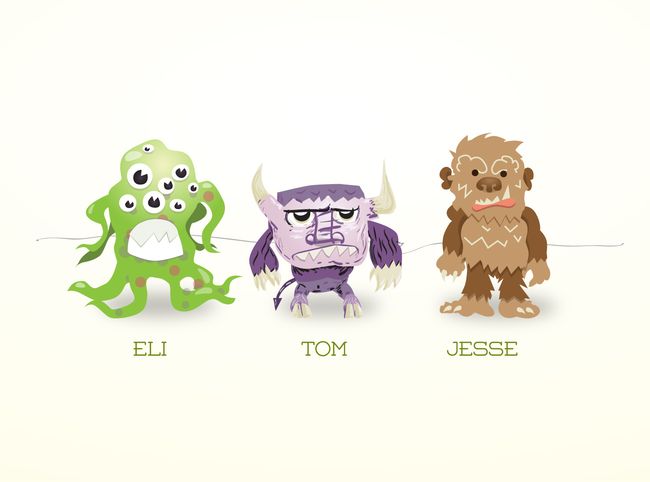
Okay, now we’re finally talking about proportion. But let’s not talk about how it works in traditional email design. Let’s talk about proportion when we’re scaring children. Eli, Jesse, and Tom are brothers. They’re also monsters, the kind that scare children. They all want to scare your nearest toddler when they open an email. And since they’re brothers, they’re all travelling together. You have three seconds to tell me which monster looks scarier than the rest… go!

You know what? Those monsters are just too tiny! Let’s make them bigger. I’ve heard bigger monsters scare toddlers more than small ones, and I want our audience to be terrified!
Huh? I could have sworn if we made them bigger, they’d strike a more terrifying silhouette? What happened?
It turns out that scariness, the quality we’re after, is affected by the relative proportion of each monster to one another. If all 3 monsters are the same size, one is not dramatically scarier than the other. And if they all get larger at the same rate, the relative proportion remains constant. You can tweak one specific attribute or another to increase the effect slightly: kids might be more scared by horns than pointy ears, for example. However in order to really pump the scariness quotient up, we need to make one monster larger than the others and keep the other two small.
Now we clearly see that Eli is a raging torrent of terrification, and his brothers are clearly less threatening.
This is how we avoid MEBS. We force ourselves to bring out one key piece of content we want to feature, and make a hard decision to de-emphasize the rest. Two things will remain relatively consistent. The first is the email window of a user’s preferred email client. Cramming it wall-to-wall with big, loud graphics is a sure-fire way to overload our other constant, our customers’ short attention spans.
In my experience, the best way to avoid MEBS is with a short planning session. I like to sit down before I make any graphics and sketch with graph paper and pencil, blocking out large chunks of a grid to visualize a layout. If you’re not a designer, consider listing your marketing objectives for a given project and ranking them in order of priority. We’re talking 5-15 minutes, max. 5 minutes of planning forces me to figure out what details I really want to communicate, and what’s not quite as important as I thought. Getting a second opinion to spot check your planning is not such a bad idea either.
So pick one key message that’s important, and let the other messages sink into the background. Don’t panic! If your primary message is relevant enough to draw them in, they’ll naturally want to read more, without feeling bombarded with information. Emphasize the product you really want everyone to buy, and support it with a few smaller product shots in case they’re looking to buy something else. But don’t think users want, or should want, to care about everything you want to tell them.
I understand this goes counter to about 75% of the marketing world’s instincts. But take a deep breath and learn to let things go. Making everything bigger doesn’t work. It won’t help you engage your customers just like it won’t help monsters scare children. Learn to keep a few things small.
Super special bonus! Download an .eps of the monster drawings! I have no idea why you’d want them, but you deserve something for reading my blog post. I’m very grateful!
F.Y.I. This art is released under the Gnu GPL.
Posted by Patrick Leahy.
Patrick Leahy is the Graphic Designer, Interaction Design Team at VerticalResponse. Connect with him on Twitter at @HelloPartick.
Related Posts:
It’s Not You, It’s Outlook – The Complete Guide for Email Marketers
Great Scott! 5 Email & Social Marketing Tips from the Future
© 2012 – 2018, Contributing Author. All rights reserved.


