Making Your Emails Mobile Friendly
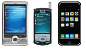
According to Forrester Research, 78 percent of email users in the United States will access their emails via mobile by 2017. If your emails aren’t designed with the mobile reader in mind, you’re losing out on a major biz opportunity that’s only going to grow.
How can you make a mobile email pop? What steps should you take to get mobile readers to open, read and respond to your message? Check out the eight tips below to help you create effective mobile emails.
1. Simplicity Rules
Keep your email design and content simple. The cleaner it is, the more likely it will appear the same on all devices – from mobile to tablet to desktop.
Organize your content so that the most important stuff is on top. Make the message clear and easy to find.
Make your content digestible with bullets and lists. Short paragraphs and sentences are your friends, too!
2. Subject Comes First
When checking their emails, mobile users tend to scroll down their inboxes until they come across a catchy or interesting subject line. So how to spice up your subject line? Remember the following points:
- Put everything important in the beginning. (For example, if you’re promoting a sale, start your subject line with “50% Off.”)
- Don’t be a Chatty Cathy. Give all the needed details, and end scene.
- Take advantage of the pre-header (this is like a secondary subject line). You have about 100 characters to make the email seem worth reading.
- Personalize who the email is from. Make the sender obvious, whether it be your name, the name of your company or an employee that the recipient might recognize.
3. Less Is More
Don’t use too many images in your message. Less is more when it comes to mobile emails. Remember, some recipients may have images turned off in their email client, so write out the important stuff in text, not within an image. Other tips:
- Clearly communicate your brand by including your biz logo as an image. Pictures are more likely to be remembered.
- Use alt tags, so that even if the email client blocks images, they can still see your offer or the most important takeaways.
- Follow the “3/4 text, 1/4″ images rule. Make sure all important information is in your text.
- Use small pics. Large images can time to download, especially with mobile users who might not have the greatest wireless Internet connections. The last thing you want to do is make them wait!
4. Links are Your Friends
Since you’re designing a simpler email, you need to avoid having too much text. The best way to do this is to link to longer articles – whether it’s a blog post, landing page, specific page on your website, online guide or sign-up form. A few tips on this front:
- Don’t crowd links. Put too many links together, and people might be tapping the wrong link, causing confusion and frustration. No bueno.
- Include links to important or popular pages. Think of a page on your website or a landing page that’s relevant to the text that’s being linked.
5. Build a Button
People who read email on their phones are more likely to be scanning content, since they’re usually on the go. So make that Call to Action obvious! A button is great for this; it’s easy to find, large enough to press with a finger and doesn’t require any direction.
- Use 45 pixels as your button size; it’s ideal for fingers of all shapes and sizes.
- Add about 10 pixels of space around the button in case your readers get click-happy.
6. Scrollin’ like It’s Hot
Readers want the message to conform with the size of their screen, so make it easy on them. No major zoom in, zoom out, left to right, up to down. Take your emails to the gym and slim the message down.
Keep your emails about 500 to 600 pixels wide. Many email service providers offer templates that are at this size, so creating one should be easy..
7. Optimize the Text Version
Remember: Not every device will show the awesome pics in your email. So you need to have a text-only version of your email for these situations. Review your text-only backup to confirm it will be easy to read on a smaller screen:
- Break up the text. Emails usually have line breaks at about 60 characters, and 20 for mobile devices.
- Keep it short. Use short paragraphs (one to two sentences), then link to a website or landing page for further reading.
- Don’t bunch up links. It will be harder to click links in the text version if they are close together.
8. The Bigger Picture: Think Landing Pages
Emails for phones also need more mobile-friendly landing pages and websites that are a piece of cake to read on a small screen. Try the following:
- Leave room to breathe. White space around paragraphs and images is money. Content clutter is a major eyesore, and readers probably won’t stay for long. Keep it simple!
- Break up the content. Make your content easy to consume with short sentences and numbered lists – the same way you’d design that mobile-friendly email.
- Remove Flash: Stuff designed using Adobe Flash is fun, but not for your landing pages. Apple products are a large piece of the mobile market pie, and they don’t support Flash (for now). Other devices that support Flash have long loading times and can make the reader impatient.
Keep these eight tips in mind when creating your new killer mobile emails and designing mobile-specific landing pages. Your readers will stay and play!
© 2013 – 2018, VerticalResponse. All rights reserved.


