Proven pop-up practices for different industries
If you haven’t used pop-up forms on your website, then you’re missing out on one of the best ways to build your email list. With custom Pop Ups from VerticalResponse, for example, it’s easy to collect email addresses from consumers who visit your website or Landing Pages. As time goes on, you can use that information to personalize future email campaigns.
But how can you make the most of Pop Ups? We recently walked through some quick tips for using Pop Ups in different types of businesses. Keep reading for even more excellent uses of Pop Ups, no matter your industry.
Pop Up tips for nonprofits
Pop Up when engagement is high. People who visit your website are likely interested in your organization, so Pop Ups can give them the chance to sign up and stay in the know. Place your Pop Up at the end of your most recent blog post, or catch visitors’ attention with a Pop Up that’s triggered when they’ve scrolled down the page to learn more.
Target the right people. If people are interested in donating their money or their time to your cause, they’re prime candidates for your email list. Why not embed a Pop Up on your donation form, volunteer registration form or donation acknowledgment page? But be cautious about interrupting visitors who are looking to donate: Keep an eye on your website analytics to be sure your Pop Up isn’t preventing visitors from completing those tasks on your website.
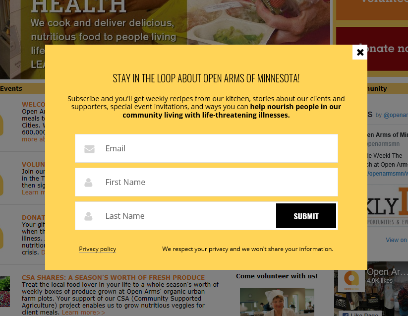
Keep Pop Ups polite. This pop-up form from Open Arms of Minnesota uses heartfelt language to connect with visitors and lets them know exactly what they can expect to receive when they sign up. The form reflects the colors of the organization’s brand, and it can be closed at any time.
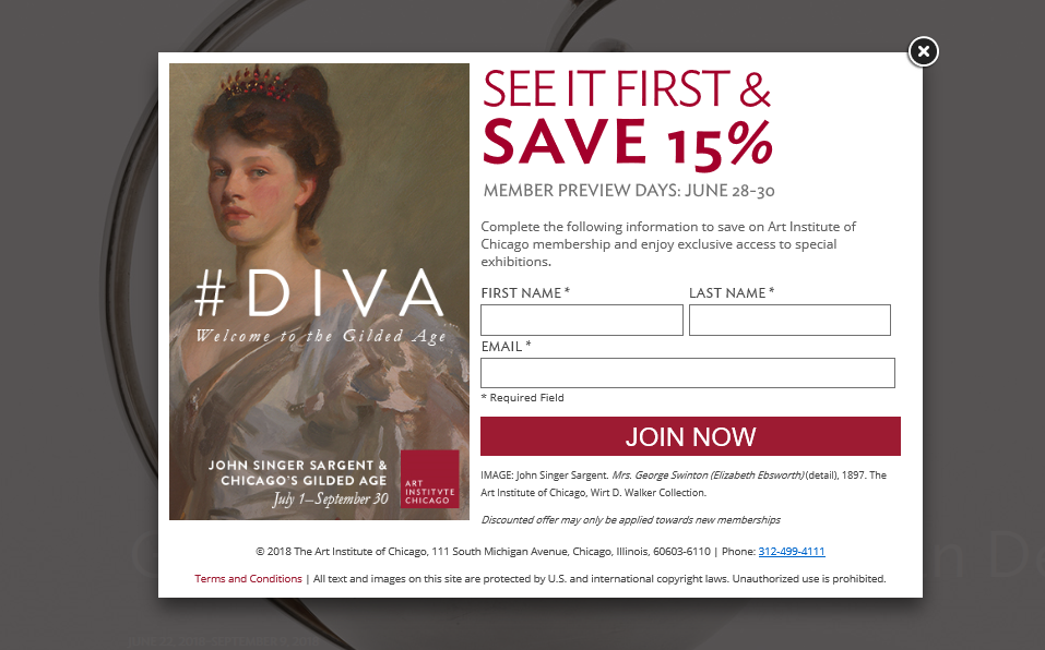
Offer exclusive rewards. The Art Institute of Chicago gets visitors excited to join by rewarding them with subscriber-only perks.
Pop Up tips for restaurants
Grant early access to events. Does your restaurant offer live music or other special events? Place a Pop Up on the webpage where you let visitors know about the fun events you have planned. Encourage them to sign up for your newsletter and stay in the loop about upcoming shows.
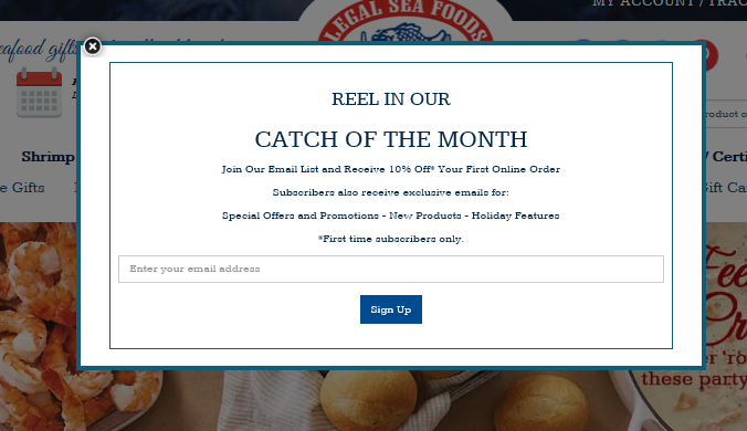
Offer a discount. If you offer gourmet food and gifts for sale online, you can place your Pop Up on your online shopping page. Legal Sea Foods offers first-time email subscribers a discount, which makes their luscious lobster even sweeter to shoppers.
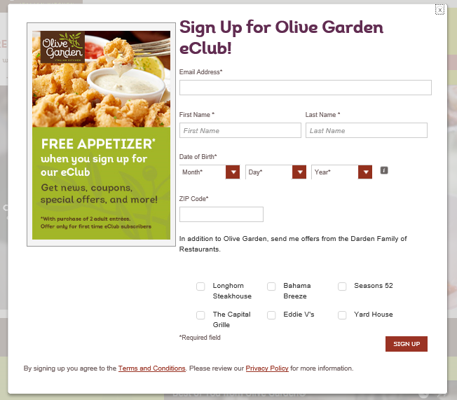
Make visitors crave your content. Olive Garden entices hungry visitors to sign up for their eClub with a photo of scrumptious food and the promise of a free appetizer.
Pop Up tips for service companies
With dozens of laundromats, landscapers, salons, mechanics and other service industry companies online, it’s crucial to stand out from the crowd. One way to do this is with Pop Ups. Start by adding a Pop Up to your services page because people will go there to see how your offerings and prices stack up to similar businesses in town.
Then move beyond the services page and get poppin’ with these tactics:
- Drive sign-ups by giving email subscribers a chance to win a free year of lawn care, car washes or other great prizes.
- Invite people to join your email club for access to new specials, discount coupons and a freebie on their birthday.
- Make your Pop Up the key to unlocking subscriber-only content and tips and show off your expertise in the process.
- Give email subscribers a free gift for signing up, such as a webinar, workshop, step-by-step tutorial, checklist or e-course.
- And if people are leaving your services page, use an exit pop-up to offer a free consultation or promo code for their next service.
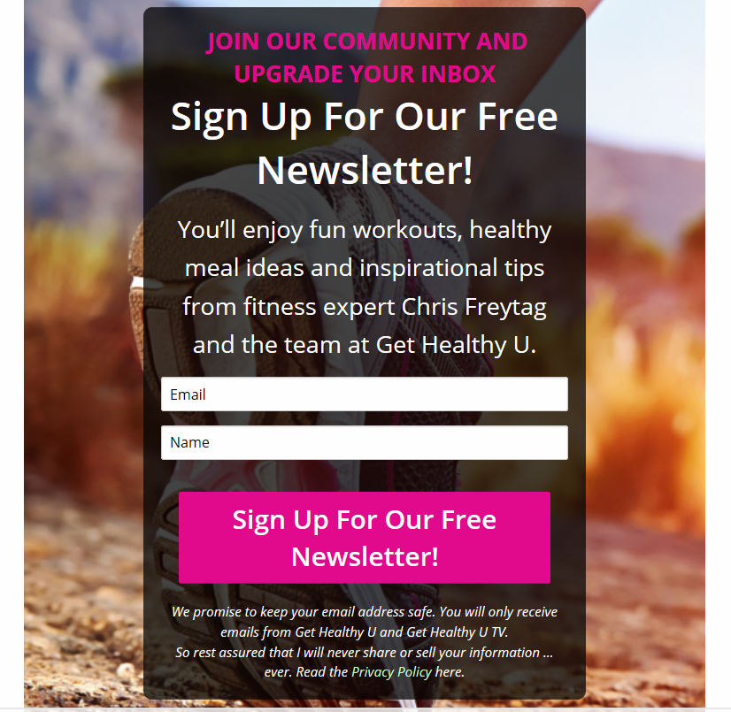
In the example below, gethealthyu.com creates a compelling offer by inviting subscribers to join their community, get a free newsletter and receive a bonus weight loss e-book.
Pop Up tips for retailers and e-commerce businesses
Pop Up for a purpose. Place a Pop Up with a coupon on your sales or shopping cart page to give people some added incentive to complete the checkout process. Or use a Pop Up that’s triggered when a visitor tries to leave your website (an exit pop-up) to capture their information before they bounce.
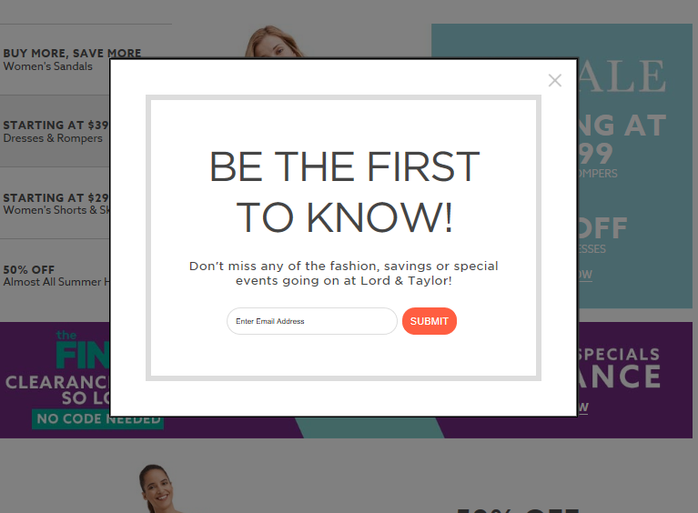
Make subscribers feel special. Offer them a first look, a sneak peek or an exclusive update the way Lord & Taylor does in the example below:
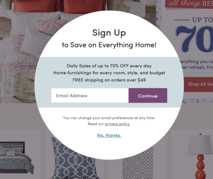
Create an irresistible offer. Wayfair uses a pop-up form to spotlight whopping daily sales of up to 70 percent off home furnishings.
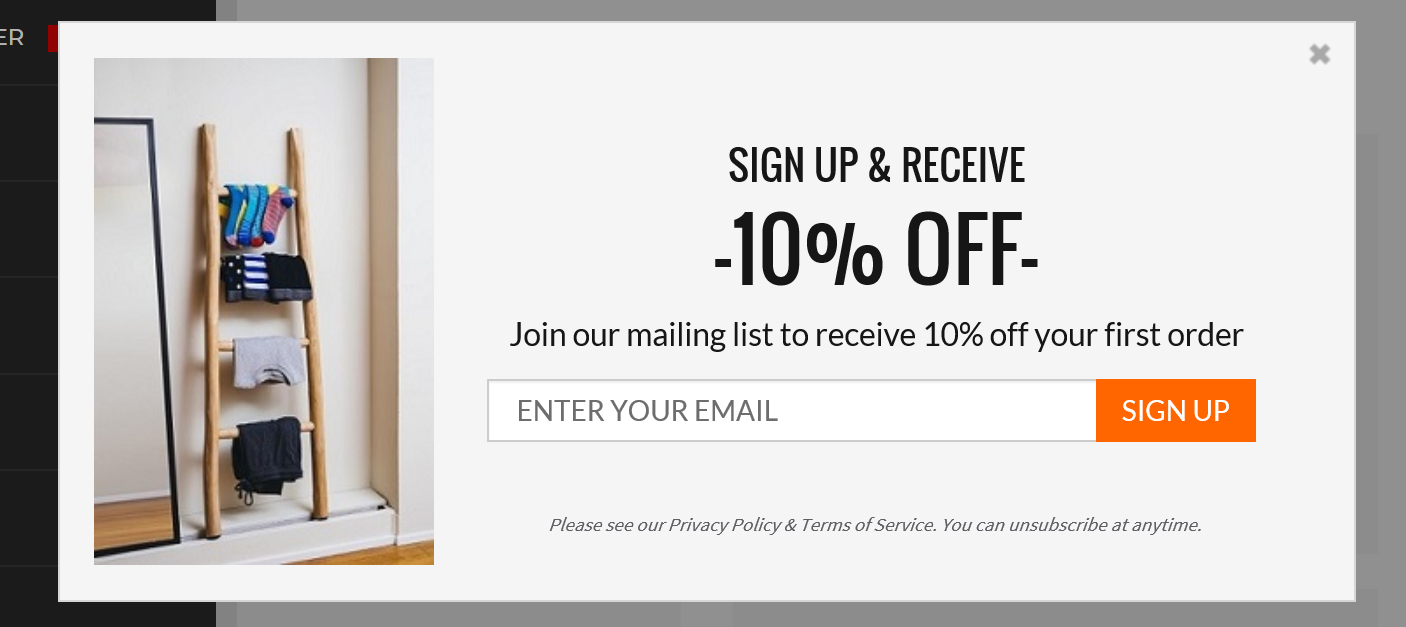
Use multiple Pop Ups. Vary your Pop Ups to keep your audience engaged. In this example, Basic Outfitters uses a discount to grab visitors’ attention:
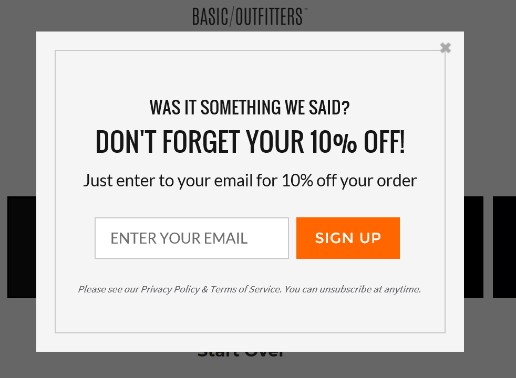
Sometimes people aren’t quite ready to buy, and they need a gentle nudge. Basic Outfitters uses the pop-up form below to offer folks a friendly reminder, along with an incentive to complete the checkout process:
If it looks like shoppers have had a change of heart and are getting ready to leave the site, give them a reason to reconsider. Basic Outfitters asks for their email address with an exit intent pop-up form that reads, “Not ready to commit? Sign up, and we’ll keep you in the loop on all things new and exciting.”
By now you should realize that Pop Ups are good for your business, no matter your industry. They can grow your email list by leaps and bounds, but not all pop-up forms will work for your audience and website. Use the examples in this article as a springboard for creating your own powerful Pop Ups with VerticalResponse. Then A/B test your Pop Ups to measure their effectiveness. VerticalResponse lets you experiment with design, triggers and placement of your Pop Ups to make sure you’re getting them just right.
Build, send and track emails that look great on any device
© 2018, Chris Duncan. All rights reserved.
 SIGN UP FREE
