The Do’s and Don’ts of Building HTML Emails
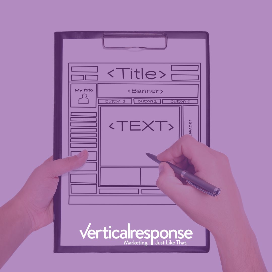
When it comes to email marketing, HTML emails are the way to go. They look more professional than plain text emails and can be more interactive. However, there are a few things you need to keep in mind when building them. In this blog post, we will discuss the dos and don’ts of HTML email design so that you can create beautiful and effective email campaigns!
Do’s
- Pick up a good HTML coding software: there are plenty of options like Dreamweaver, Notepad ++, and Sublime Text. These will work just fine!
- Code Mobile First: Most email is now read on mobile devices, so it’s important to code your email with this in mind. Use a responsive design so that your email looks good on both desktop and mobile devices.
- Keep email width under 650 pixels wide: You want your email to be easy to read, so keep the width under 650 pixels. This way, recipients won’t have to scroll horizontally to read your email.
- Use Tables when coding your email: Tables will help you control the email’s layout and make sure everything looks neat and organized. You can also use CSS to style your HTML email, but be aware that not all email clients support CSS.
- Choose Inline CSS: It’s more likely to be rendered properly by email clients than embedded or linked CSS because email clients often strip out or ignore embedded or linked CSS.
- For extended content, link to an outside source: You want to do this If you have a lot of content that you want to include in your email. That way, recipients can click through to read the rest if they’re interested.
- Use images hosted on your website or a third-party image hosting site: This will ensure that your email looks good and loads quickly, even if the recipient’s email client doesn’t support images.
- Stick to the 80/20 rule: 80% text and 20% images. Too many images can make your email look like spam and can result in your email being sent to the recipient’s junk mail folder.
- Use a URL shortener for long URLs: Large links inside your email can look like spam, so use a URL shortener to make them look neater and more professional. There are great shortener alternatives like Bit.ly and TinyURL which you can even link to your own domain
Don’ts
- Embedded videos: Email clients can’t display embedded videos, so your email will just show a blank space where the video should be.
- Image-only emails: Like with embedded videos, email clients can’t display images by themselves. Your email will just show a blank space where the image should be. Always include text in your email to make sure your content will be read no matter what.
- Stay away from large images: They can make your email take longer to render or even worse and look like spam with the risk to be placed inside the spam folder. Instead, try to keep your email under 100kb.
- Designer fonts are pretty but not a good idea: Stick to common fonts like Arial, Times New Roman, and Verdana. email clients may not have the same fonts installed, so your email could end up looking very different from how you intended.
- Background images: Using background images inside an email is not recommended because email clients often block images by default, so your recipients would have to enable them to see the background image. Even if they do enable images, still some email clients may not display them. Alternatively, you can use a colored background instead
- Javascript and embedded Forms: email clients don’t support Javascript or forms, so your email will just show a blank space where the form should be. A more convenient approach would be to link to a form hosted on your website
Have you found these tips useful? Do you have any other suggestions? Share them with us in the comments below!
Happy emailing! 🙂
© 2022, VerticalResponse. All rights reserved.


