Don’t Make Us Think! Web Page Design Tips
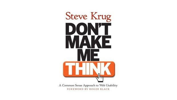
Ever read a book called, Don’t Make Me Think by Steve Krug? It’s a cool, quick read about web page design. It explains that you should think like your wesbsite visitors, and you need to make it as easy as possible for them to find what they’re looking for. Seems like second nature, right? But the book also explains the “why” of it all. Here are the top things we got out of it:
Get rid of “happy talk” on your site – People don’t read, they scan. Everyone’s in a hurry, so don’t start your web pages with a “Welcome to this great page. Here’s what it’s going to do for you and here’s why…” Simply get to the point with some bullets and quick copy so visitors can decide if they want to click further, or not.
“Instructions must die” – If you need to use tons of instructions all over your site to tell people what to do, your design isn’t working. Go back to the drawing board and redesign it.
Colors don’t matter – Ignore comments about colors since very few people are going to leave your site because of the color.
There’s no place like home – Seems obvious, but always have your logo in the upper left hand corner of your site and all subsequent pages. If people get lost, this might be their only way to get “home” instead of leaving out of frustration.
Check it out the book and let us know what you think in the comments!
© 2013, VerticalResponse. All rights reserved.
![Open AI vs Claude: What Small Businesses Need to Know for Smarter Email Marketing [2026]](https://verticalresponse.com/wp-content/uploads/2026/03/a7d5a329-9653-486e-af92-d645f63d8b64-1.png)


