Check out our new look
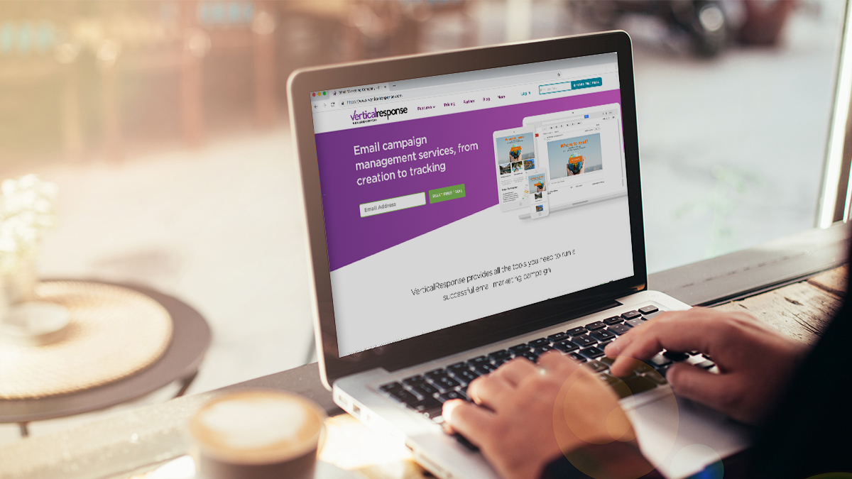
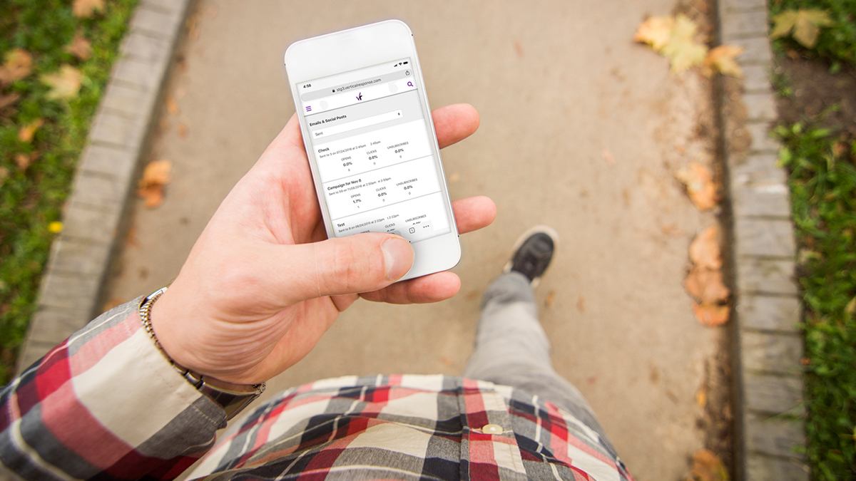
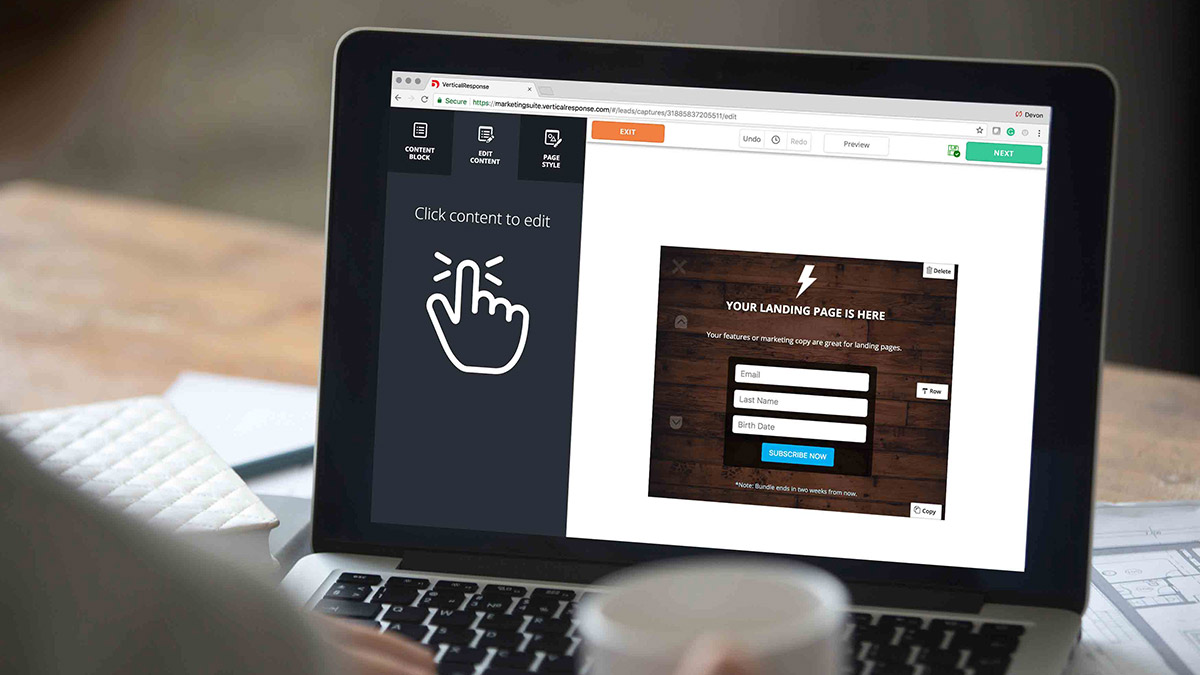
Things look a little different here at VerticalResponse. We’re excited to announce that we’ve updated the app’s interface and design to make email marketing even faster and easier than before. Here are a few of the exciting changes:
Cleaner interface
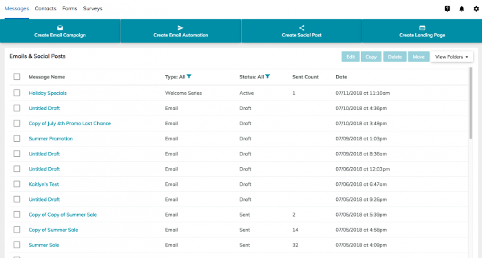
We’ve streamlined the app’s interface, so you can quickly locate the tools you need to manage your contacts:
New action bar
Ready to create an email campaign, social post, Landing Page or Email Automation? Getting started will be simple with the blue action bar. Everything you need to kick off your next project will now be found at the top of the page:

(One slight functional change in the new interface is that in the top menu above the blue action bar, “Leads” have been replaced by Forms. Click on Forms to create Pop Ups.)
Updated look
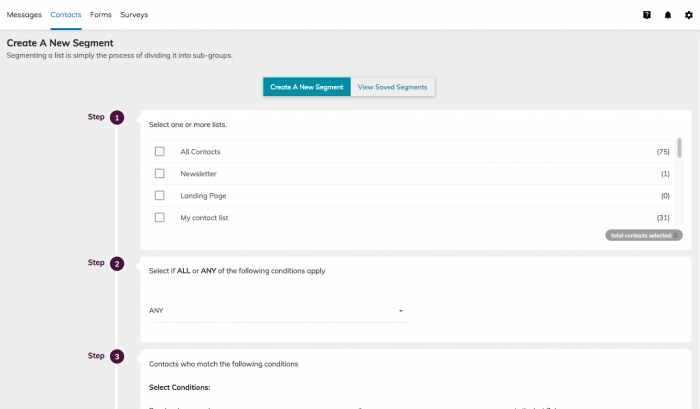
VerticalResponse retains the same functionality you’re familiar with, but with a sleek, modern look:
Log in to your VerticalResponse account and check out the changes!
Build, send and track emails that look great on any device
© 2018, Amber Humphrey. All rights reserved.
 START YOUR FREE TRIAL
