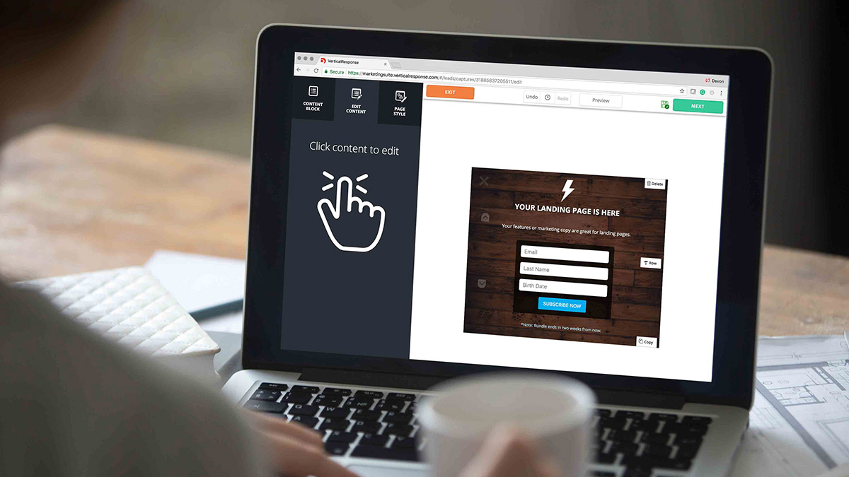
How to make Pop Ups work for you
A small business can’t sustain itself if it isn’t attracting new customers. Lead generation is the key to growth and generating more sales. While there are many effective ways you can approach this ongoing mission to reach new prospects, embedding VerticalResponse Pop Ups that collect visitors’ email addresses into your website or Landing Pages is one of the easiest.
To ensure that your Pops Ups are seamlessly integrated into your website and create the best user experience possible, you need to know when and where it’s most appropriate and effective to use them. Just as you would optimize your website’s overall design according to industry, you can do the same for the Pop Ups you use. To help you get the best results, here are some ideas of where on your website to place your Pop Ups according to the type of business you operate.
Nonprofit organizations
Visitors to nonprofits’ websites are likely to be the most engaged with your content and your cause while reading about your organization’s mission, needs and successes. Encourage these prospective supporters to sign up for your newsletter by placing a Pop Up on your most recent blog article or the “latest news” page of your website.
Tip: A Pop Up that’s triggered when visitors scroll down the page is ideal, as the act of scrolling implies that they’re interested in what they’re reading. If they’re interested in the content, then they’re more apt to share their information with you and sign up for your email list.
Retailers and e-commerce shops
Retailers who sell products online or showcase on their website what they have in stock can embed a Pop Up on their product page. This is a page where prospects want to learn more about what your store has to offer, so you don’t want to miss out on this opportunity to connect with them.
Tip: To ensure you don’t distract them from making a purchase, use a Pop Up that’s triggered when a visitor tries to leave your website — often referred to as an exit pop — to capture their information before they bounce.
Bonus tip: If a visitor ultimately doesn’t make a purchase or decides to leave your website, it doesn’t necessarily mean that they aren’t interested in your shop. Adding an exit Pop Up gives you a chance to continue marketing to people who might not be ready to make a purchase, but are still curious about your merchandise.
Service industry companies
When people visit the website of a wedding planner, plumber, mechanic or other service industry professional, they’re often doing research. They’re comparing your prices and what you offer to your competitors. Place a Pop Up on your services page to reach out to them when they’re spending the most time with your content.
Tip: While visitors might not be prepared to immediately book a consultation, they may be interested enough in what they see to find out more about your company and continue their research through email.
Restaurants
Does your restaurant hold private or community events? Do you cater? Are there nights where you serve special menu items? The page on your site where you let visitors know about all the exciting or unique things happening at your establishment is a great place to put a Pop Up.
Tip: When you ask visitors to sign up for your newsletter, tell them in a sentence or two that when they sign up to receive your emails, they’ll be the first to know about events, menu updates and so on.
For all businesses
As with any updates to your website’s design, don’t forget to A/B test your Pop Ups. For example, your audience may be more receptive to Pop Ups that are immediately triggered when they land on your website than they are to Pop Ups placed on a sidebar. With VerticalResponse, you can experiment with design, triggers, and placement of your Pop Ups, and learn what works best for your audience and website.
Build, send and track emails that look great on any device
© 2018, VerticalResponse. All rights reserved.
 SIGN UP FREE


